
Design Tips to Make Your Portfolio Stand Out
Let’s Be Honest, Looks Do Matter (At Least a Little)
You know when you open someone’s portfolio, and everything just feels… right? Like a visual hug? That’s not an accident. The color palette, layout, and design choices are all doing quiet little dances in the background, making sure you feel something. A well-designed portfolio doesn’t scream for attention, it invites people to stay a while.
Now I’m not saying you need to be a graphic designer to make your portfolio sing, but the visual elements you choose can seriously affect how your work is received. A chaotic layout can distract from your art, while an overly minimal one might feel cold. Balance is the sweet spot.
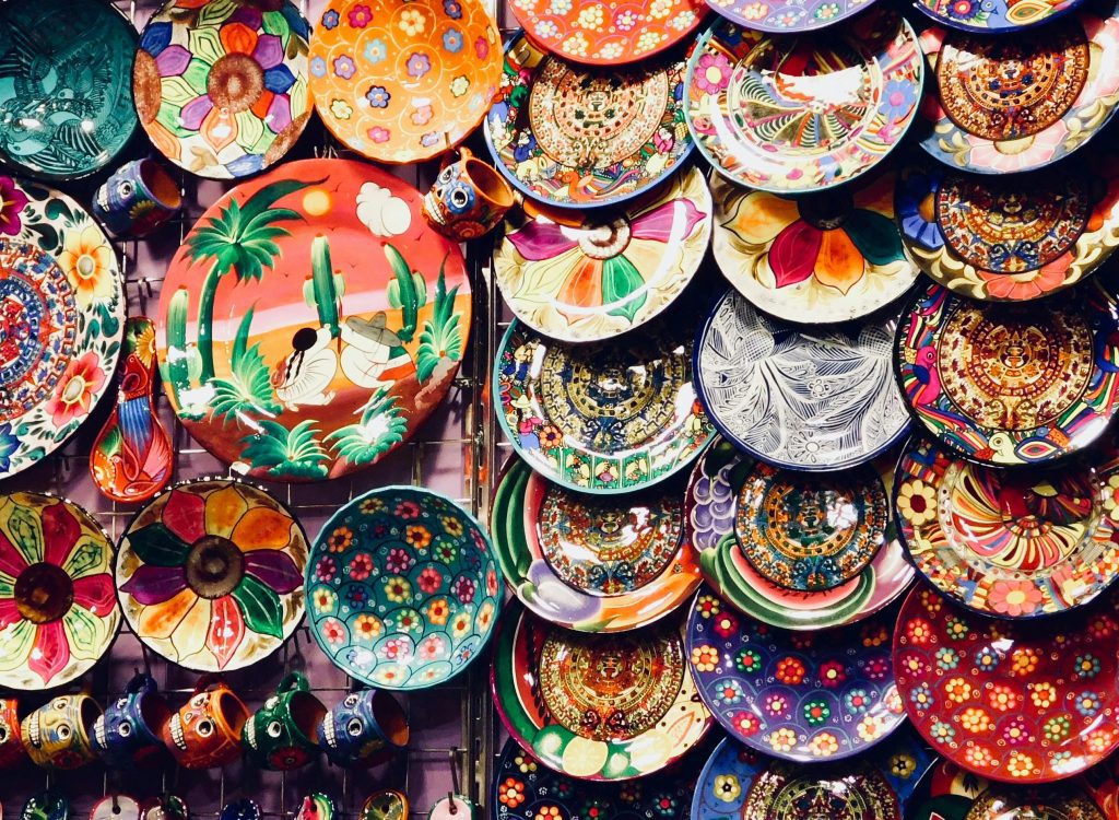
Think about it like curating a gallery wall. Would you throw all your pieces onto a wall without thinking about how the colors talk to each other? Probably not. Same goes for your portfolio. Cohesiveness is a love language.
Even your font choices matter. Yep, fonts. A playful handwritten typeface might suit a children’s book illustrator, but it would be totally off for a conceptual photographer. Design tells part of your story before anyone reads a single word.
When your design supports your art instead of competing with it, magic happens. Viewers aren’t just seeing your work, they’re feeling it.
What Is “Visual Harmony” Anyway?
Let’s get a little nerdy (but in a fun way). Visual harmony is when all the elements of your portfolio, colors, fonts, spacing, layout, come together to create a mood that aligns with your voice as an artist. It’s not about being perfect, but about being intentional.
If you’re more of a mixed media artist, you might want bold contrasts and overlapping textures in your layout to reflect your layered practice. If you’re into calm landscapes, soft neutrals and airy spacing might make more sense.
The point is, your visual design shouldn’t be random. It should echo what your work feels like. When people see your portfolio, they should instantly get your vibe, even if they haven’t seen your statement yet.
When your design mirrors the emotion of your work, people won’t just see your portfolio. They’ll feel it. That’s what keeps them scrolling, reading, and hopefully… reaching out.
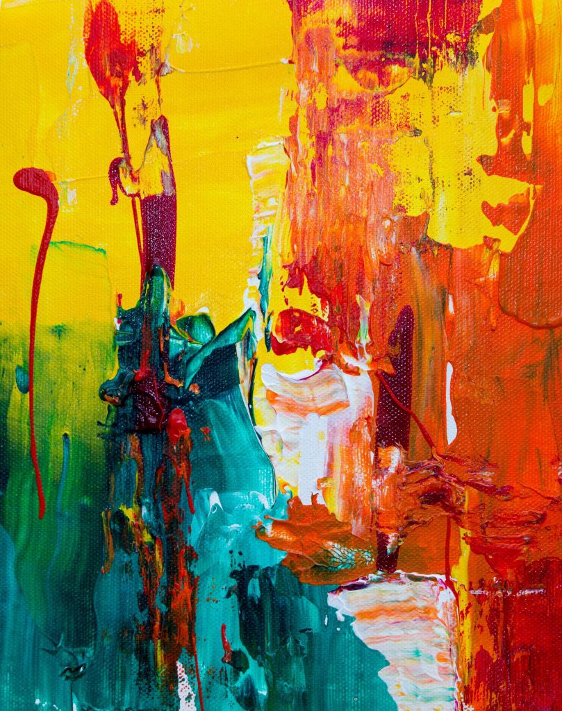
Color: More Than Just a Pretty Touch
Color is powerful. It can set the tone of your portfolio before anyone even sees your art. Warm tones can evoke energy and intimacy, while cooler palettes often give a sense of calm or professionalism. You can use color to reinforce your artistic voice.
Let’s say you use a lot of blues and grays in your paintings. Using those same tones in your website background or headers can tie everything together. That’s intentional storytelling through color.
But don’t go overboard. Bright neon pink might be fun for an accent, but if it’s your background, it could overwhelm your work. Your art should always be the star. Color should be the supporting act, not the lead singer.
Also, think about consistency. Try to use the same shades across your website, business cards, and artist statement. It makes you look polished and professional, even if you’re just starting out.
There’s nothing wrong with experimenting! Just always ask: “Is this color helping or distracting?” If it’s the latter, maybe it’s time for a little design edit.
Fonts Have Feelings Too
Okay, hear me out: Fonts are vibes. Really. A font can whisper “elegant,” shout “quirky,” or mumble “I didn’t really think this through.” Choosing the right font for your portfolio isn’t just about readability, it’s about tone.
Serif fonts (like Times New Roman or Georgia) can feel traditional or literary. Sans-serifs (like Helvetica or Arial) are modern and clean. Script fonts? They’re fun, but use them like seasoning, not the main dish.
Let’s say you’re a textile artist creating colorful, playful work. You might choose a friendly rounded font that mirrors that playfulness. On the other hand, a conceptual photographer might opt for something sleek and minimal to match the work’s tone.
It’s also about hierarchy. Your name should be big and proud. Your section titles should be clear. And your body text? Easy to read without squinting, please and thank you.
Don’t forget accessibility. Fancy fonts are great until someone can’t read them on mobile. If your viewer has to work hard to read about your art, they might not get to the art at all.
Layout: Your Portfolio’s Flow Matters
Have you ever been to a gallery where everything feels scattered, and you don’t know where to look first? That’s what a cluttered portfolio feels like. A good layout gently guides people through your story, without them even noticing.
Start by deciding what you want people to see first. Your strongest piece? Your artist statement? A gallery overview? Think like a curator: What order will make the most impact?
Use white space generously. It’s like taking a breath between words. It gives your art room to shine and makes your portfolio feel calm and collected, even if your art is bold and messy.
Use grids or columns to keep things aligned. You don’t need to be rigid, but some structure helps people stay focused. If things jump around too much, it can feel like visual whiplash.
And always preview your layout on different devices. What looks beautiful on a laptop might be a hot mess on a phone. Trust me, check both.
Design That Speaks Before You Do
When your portfolio’s layout and color palette feel just like your work, you’re already making a statement. And if a gallery or curator suddenly asks for an exhibition catalog, you’ll want something visually consistent and ready to go. The Digital Exhibition Catalog Template for Artists lets you quickly build a gorgeous catalog that mirrors your portfolio style, no scrambling, just polished presence.
Matching Your Design to Your Medium
Different mediums call for different kinds of presentation. A digital artist might lean into techy, sleek design, while a ceramicist might go for earthy tones and natural textures. Your portfolio should feel like an extension of your material world.
If your work is tactile, include close-up images or texture-inspired backgrounds. If your process is clean and digital, you can echo that with crisp lines and minimal spacing. Let the medium guide the mood.
This doesn’t mean you’re locked in a box. It just means you’re aligning your visuals with what your viewer expects to feel. Surprise is great, but confusion isn’t.
Also, think about how your design reflects your values. Sustainable artists might avoid heavy animations that eat up energy. Feminist artists might choose inclusive fonts and colors. Your design choices can amplify your message.
When your portfolio feels like your work, you create a full experience, not just a digital resume.
Using Visual Storytelling (Without Words)
Let’s say someone skims your site and doesn’t read a thing. Can they still understand what you’re about? That’s where visual storytelling comes in. Design isn’t just decoration, it’s narrative.
Think about the journey your viewer takes. Do they start with an emotional piece? Do they transition into softer works? Your layout should create a rhythm that flows like a story arc.
You can even use design to emphasize transitions in your career. Maybe your older works are in one muted tone, and your newer ones are more vibrant, reflecting a shift in your voice or confidence.
Small details matter. A thin line between two series. A shift in background shade when you move from personal work to commissioned pieces. These subtle signals add up to something powerful.
Visual storytelling makes your viewer feel like they know you, even if they haven’t read a word. And that kind of connection? It’s golden.
How to Find Your Style Without Getting Overwhelmed
With so many fonts, colors, layouts, and design platforms out there, it’s easy to get lost in the sauce. But remember, your design should feel like you, not like someone else’s template.
Start simple. Choose 2–3 colors, 1–2 fonts, and one layout style you love. Test it out. See how it feels when paired with your work. Tweak it. Then tweak it again.
Look at portfolios of other artists, not to copy, but to get inspired. What do you love about them? What don’t you love? Use that feedback to guide your own design choices.
And don’t be afraid to ask for feedback. Sometimes we’re too close to our own work to see what’s not clicking. A friend’s fresh eyes can be a game-changer.
Your style will evolve. That’s a good thing. Just make sure every update still feels true to who you are and where you’re going.
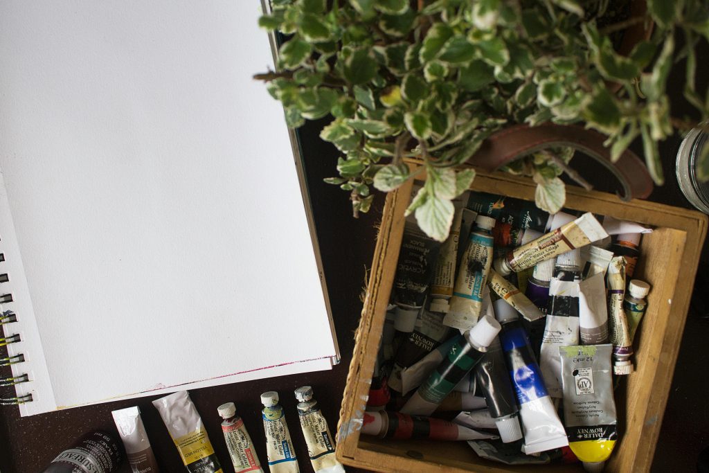
Free Tools That Help (Without Feeling Like Homework)
Don’t worry, you don’t need to hire a designer to make your portfolio pop. There are free (and friendly) tools that can help even the most tech-averse artists.
Canva is fantastic for designing cohesive visual elements, like headers, graphics, and even simple mockups. It’s drag-and-drop and beginner-friendly.
Adobe Express is another great one if you want more control but less overwhelm than full-on Photoshop. And if you’re building your site, Wix or Squarespace offer beautiful templates you can customize without code.
Need a color palette? Try Coolors.co or Adobe Color Wheel. You can even upload an image of your art, and it’ll suggest matching colors.
Using these tools isn’t cheating, it’s resourceful. Think of them as paintbrushes for your portfolio’s frame.
A Real-Life Example: Soft Pastels & Bold Intentions
Let me tell you about an artist named Zara. She’s a painter who uses soft pastels and delicate brushstrokes. But for the longest time, her website was black, with harsh fonts and a grid that screamed modern minimalism.
Once she aligned her portfolio with her artwork’s gentle tone, switching to warm beiges, serif fonts, and hand-drawn headers, everything clicked. Galleries stayed longer. Emails rolled in. Her visual story finally matched her voice.
Zara didn’t change her art. She changed the way people entered her art. And that made all the difference.
Design Isn’t Fluff, It’s Framing
Your portfolio is the first impression. It’s your handshake, your smile, your “hey, this is me.” Design and color are the elements that give that intro personality.
Don’t overthink it, but don’t ignore it either. Just like a great frame enhances a painting, thoughtful design enhances your work. It shows the world you care about how your work is seen.
Remember, your art deserves a beautiful, intentional space to live in. Let your design reflect your care, your process, and your purpose. You don’t need to be flashy. You just need to be you.
Because when someone opens your portfolio, they’re not just looking for art. They’re looking for connection. And your color and design choices? They help build that bridge.