
5 Things Jurors Look For in Artist Portfolios
Artists often focus on the work itself, and that focus is essential, but the way the work is presented creates the first layer of trust. A strong piece can lose its impact when the surrounding details feel rushed, unclear, or inconsistent. People rarely say this out loud, but presentation becomes the quiet filter through which curators, galleries, and jurors decide whether someone feels ready for professional opportunities. The small things carry weight because they reveal how seriously an artist treats their own practice.
What surprises many emerging artists is that these details are rarely dramatic. They live in how cleanly files are labeled, how thoughtfully images are edited, how cohesive a portfolio feels, and how confidently the work is described. These choices tell a reviewer that the artist is mindful, intentional, and capable of meeting expectations. Even without a word spoken, the presentation communicates reliability, and decision-makers prioritize reliability because it reduces risk.
Across open calls, group shows, and gallery submissions, reviewers often spend seconds on each application. During those seconds, clarity becomes a gift. Clean images and well-organized folders allow the artwork to speak without distraction. When reviewers feel no friction, they absorb more of the art itself. When they encounter clutter or confusion, part of their attention shifts away from the work and toward the errors. That shift quietly influences outcomes.
Many accepted artists share a common strength, they pay attention to details that others overlook. They consider how their work appears on screen, how their files load, how their statements read, and how consistent their visual identity feels. These elements build an impression long before the work reaches a gallery wall. Reviewers interpret these details as signs of professionalism, and professionalism can tip the scale when many artists are equally talented.
Presentation also serves the artist, not just the reviewer. A clear portfolio helps you understand your own evolution. Strong documentation allows you to recognize patterns, refine direction, and communicate with confidence. When you see your work displayed cleanly and cohesively, it becomes easier to evaluate what you want to change, strengthen, or explore further. Presentation becomes part of your growth, not just a requirement.
The subtle details are powerful because they accumulate. No single choice guarantees acceptance, but together they form a story of someone who is prepared for opportunities and able to handle responsibilities that come with them. Reviewers often remember the artists who make their job easier. That ease, that clarity, that consistency, becomes a distinguishing factor. It allows your art to be seen without interruption, which is exactly what you want when someone is deciding whether to give you a chance.
The Quiet Power of Clean Edges and Thoughtful Spacing
There is something almost invisible about clean edges, yet they shape the entire perception of your work long before anyone reads your statement. Artists who take a moment to recheck borders, eliminate smudges, and leave intentional breathing room often find that curators immediately understand their level of care. This does not make the art feel stiff, it simply gives the work a frame of respect. When presentation is quiet, the art becomes loud in the best way.
Many artists underestimate spacing because it feels like an afterthought. But spacing becomes the difference between a work that feels cramped and one that feels deliberate. Curators will rarely comment on spacing directly, but they instantly register when something feels overcrowded or sloppy. A steady visual rhythm gives the viewer a moment to engage without effort. That moment can determine whether your submission stays in the running.
Clean edges communicate that you understand how your work lives in a professional context. It tells decision makers that they will not need to worry about display issues or adjustments. That small signal is powerful, especially when your application sits among hundreds of others. The artist who gives curators fewer problems to solve becomes the artist who moves forward.
Spacing and edges also influence the emotional tone of a portfolio. Even the most expressive work benefits from structure, because structure helps the viewer understand where to look first. Artists sometimes fear that restraint equals compromise, but here it becomes clarity. Your art remains free, and your presentation carries it across the line.
When you develop a habit of respecting edges and space, the rest of your professional tools begin to sharpen as well. You start noticing where your message feels tight, where your images need breathing room, and where your layout could guide someone with ease. These skills build your artistic voice in ways that extend beyond the application.
The artists who consistently get accepted rarely “wing” their presentation. They create a visual pause around every piece, and that pause acts like an introduction. Curators see confidence, not clutter. That subtle shift often changes everything.
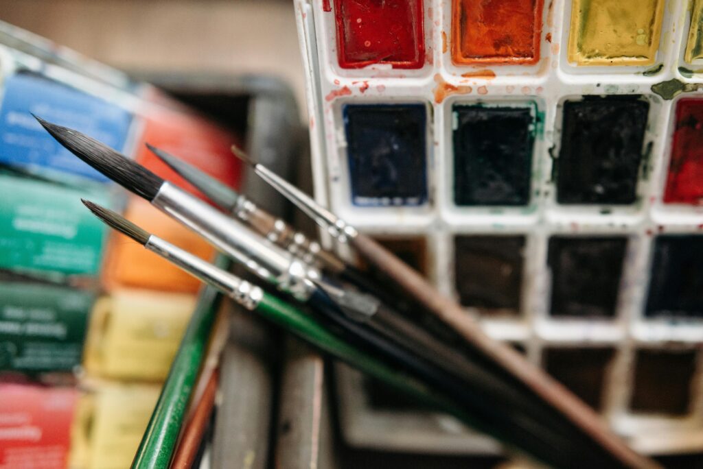
Why Image Quality Changes More Than You Think
Image quality feels like common sense, yet it is one of the biggest reasons strong artists get rejected. A stunning painting photographed under dim light becomes dull, and a vibrant mixed-media piece shot at an angle instantly looks distorted. Curators never intend to penalize artists for technical issues, but they cannot judge what they cannot truly see. Poor images create an invisible barrier between your work and the decision makers.
The mind fills gaps when looking at low-quality photos. Instead of engaging with your brushwork or technique, curators end up guessing how the colors should look. Guessing disrupts judgment. The clearer your image, the easier their job becomes, and the more your work can speak without you explaining anything. A high-quality image acts like a representative standing in the room on your behalf.
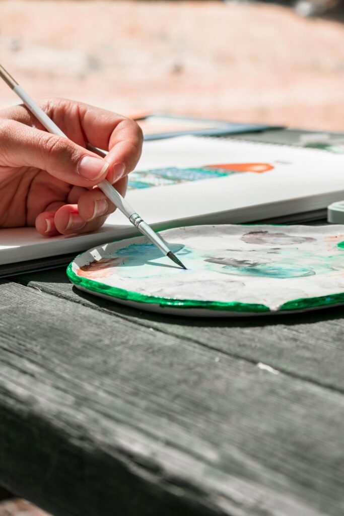
Lighting becomes one of the quiet heroes of a strong portfolio. Even simple indirect daylight can lift the authenticity of your piece. Shadows disappear, textures feel honest, and the work becomes true to life. You do not need a studio setup to achieve this, you only need a thoughtful moment where the art is placed in its best light. That moment translates directly into credibility.
Sharpness also tells an unexpected story. A crisp image gives the impression of discipline. A soft image, even if accidental, can make the work feel unfinished. Artists who take the time to retake photos until they are clear often notice an increase in responses, because clarity translates to professionalism in subtle ways that are hard to articulate but easy to feel.
Image quality also affects how your work appears alongside other artists. When curators review submissions, they scroll quickly. Your images sit next to dozens of others, and the ones that feel bright, clear, and steady naturally hold more presence. This is not a comment on talent, it is a signal of readiness. A ready artist stands out, even in a crowded selection.
A strong image does not elevate weak art, but a weak image can dim powerful art. Artists who treat their documentation as an extension of their studio practice usually see better results, because they honor their work at every step. The art deserves to be seen, not squinted at, and curators appreciate the difference.
The Details Curators Notice Before They Even Look at the Work
Before curators dive into your actual pieces, they pick up on cues that you might not realize matter. File names, for example, offer an immediate glimpse into your level of care. When the naming is consistent, clear, and easy to identify, the curator feels supported. When files arrive labeled “finalfinal2.jpg” or “IMG_9383,” the first impression becomes shaky. This is not about perfection, it is about clarity and respect for the process.
Another detail that shapes perception is how you structure your folder or PDF. When the flow feels logical, the curator moves through your work effortlessly. When the order jumps around or images are oversized, they begin to feel friction. Friction becomes distraction, and distraction reduces the emotional impact of your art. Small organizational choices shape the entire rhythm of the review experience.
The same goes for text. Artists often assume curators will overlook typos or mismatched fonts, but these things speak loudly. They indicate whether you care about communication as much as creation. A clear, calm layout with steady spacing feels like a grant writer’s professionalism combined with an artist’s visual fluency. That combination is rare, which makes it memorable.
Curators also pick up on whether you understand how much information is enough. When the text is too long, they lose the thread. When it is too short, they feel unanchored. Finding the balance creates trust, because it shows that you can communicate your ideas in a grounded way. That trust plays a bigger role than most artists realize.
Even the way you sequence your strongest pieces matters. Leading with intention rather than randomness signals that you understand how to guide a viewer. Curators do not expect a perfect presentation, but they notice when an artist has taken time to create a coherent flow. That alignment often reflects how the artist might behave during an exhibition or project.
All these small cues combine to create a single impression, that you are someone who takes their work seriously. That impression makes curators more inclined to invest their time and energy in seeing the rest. Presentation becomes the handshake before the conversation.
The Subtle Balance Between Personality and Professionalism
Every artist wants their portfolio to feel like an extension of who they are, but that desire can sometimes overshadow clarity. When a presentation leans too heavily into personality, it begins to distract from the work. When it becomes too stiff, it loses the warmth and humanity that curators are drawn to. The artists who get accepted most often find a middle ground where they feel present but not overwhelming.
Voice matters, but pacing matters more. A portfolio that reads like a monologue can become tiring, while one that feels too formal becomes forgettable. Curators appreciate artists who understand the difference between writing that supports their work and writing that competes with it. Subtlety becomes your best tool here. A calm tone with thoughtful phrasing goes a long way.
Design choices also play into this balance. Too many decorative elements make the work feel crowded, and too many minimal elements create emotional distance. The best presentations guide the eye gently without clutter. This signals that you understand how to manage attention, a skill that translates directly into exhibition readiness.
Confidence does not require embellishment. A confident presentation feels steady, grounded, and aware of its own strengths. Curators gravitate toward this because it makes the viewing experience smooth. They want to understand you, not decode you. The clearer your voice, the more your work can shine.
Artists sometimes fear that professionalism might strip away their authenticity. In reality, clarity amplifies authenticity. When the text is clean and the layout is steady, your personality reads more clearly. It becomes easier for curators to sense your intentions, values, and approach. That transparency makes them more willing to invest in you.
A balanced presentation gives the curator room to breathe, reflect, and engage with your art on its own terms. That breathing room often creates the moment where your application moves from “interesting” to “compelling.”
The Portfolio Element Almost Everyone Overlooks: Cohesion
Cohesion is one of the most underrated presentation details, and yet it shapes the entire emotional tone of a submission. When your pieces feel connected, even loosely, the curator experiences your work as a journey rather than a scattered collection. This journey builds trust. It suggests that you have a steady voice and a developing vision, two things every juror looks for in selected artists.
This does not require every piece to look the same. Real cohesion comes from intention, not repetition. You might have varying mediums, but if the themes or decisions feel aligned, the viewer can follow your thinking. Curators become more invested when they sense continuity because it suggests depth rather than randomness. That continuity can be subtle, but its impact is strong.
Cohesion also affects your text. When your statement matches your work without feeling forced, the curator understands the relationship between your ideas and your execution. When the statement feels disconnected, the whole presentation begins to feel unstable. Stable presentations feel trustworthy, and trust changes how closely your work is considered.
Sequencing becomes an essential part of this. The way you place your strongest pieces, the way you repeat certain visual cues, and the way you organize supporting materials all contribute to the emotional rhythm of your portfolio. Artists who pay attention to sequencing often notice an increase in acceptance rates because the entire presentation feels intentional.
A cohesive portfolio also simplifies the curator’s job. They do not need to piece together your narrative, because you have done the groundwork. That clarity showcases your work in a way that feels confident and self-aware. It removes confusion and strengthens impact.
If you want an easier way to build this kind of structure, the customizable digital portfolio template from Arts To Hearts Project can help guide you with clean layouts and intuitive flow. You can explore it here:. It supports the cohesion you already have, without overshadowing your voice.
How Consistency in Formatting Quietly Signals Reliability
Formatting feels like a technical detail, but in the world of art submissions, it acts like a subtle contract between you and the reviewer. When everything from font size to spacing to alignment feels consistent, the curator feels supported rather than distracted. Reviewers handle countless applications, and a cohesive format makes their job easier. That ease creates trust, even if the curator cannot articulate why.
Inconsistency does not necessarily imply carelessness, but it does introduce doubt. When text shifts unpredictably or layout feels uneven, the curator starts questioning whether the rest of the application might contain similar lapses. These questions are rarely conscious, yet they influence decisions. That influence can pull your submission down the list before your art has a chance to speak fully.
Consistency also affects how your ideas land. When visual elements repeat with intention, your voice becomes clearer and the tone feels steadier. A curator wants to feel that the artist understands how to present their practice across multiple touchpoints. This does not require design expertise, only patience and attention. Those qualities show up quietly and powerfully.
Formatting choices can become silent ambassadors of your professionalism. A neatly structured page communicates the same care you bring into your studio practice. Curators often respond well to artists who demonstrate this level of respect for the process. It shows that you value your own work enough to present it with dignity rather than haste.
Small things like consistent margins, aligned captions, and evenly spaced visuals help the curator move through your work without interruption. That uninterrupted flow increases the likelihood that they truly absorb the depth of your practice. When the viewer feels guided rather than pushed, they engage longer and with more curiosity.
A consistent format takes time at first but becomes second nature with practice. Over time, it helps your submissions feel steady, intentional, and ready for the opportunities you are reaching for. Curators can sense that steadiness immediately, and they tend to reward it.
The Role of Captions and Why They Matter More Than You Expect
Captions may seem like a minor detail, but they often shape how curators interpret your work. A clear caption supports understanding without dissolving mystery. It offers just enough information for the reviewer to locate the piece within your practice. When captions are thoughtful, they give your art context without controlling the viewer’s experience. That balance is powerful.
A caption that provides dimensions, materials, and year of creation builds confidence instantly. Missing or incomplete details can make a curator hesitate because they cannot fully understand the scale or materiality of the piece. Those hesitations accumulate during the review process and can influence their final selection. A simple, steady caption removes unnecessary barriers.
Captions also reflect your level of organization. When they follow a consistent order and format, the portfolio feels coherent and professional. When they vary in structure, the presentation becomes uneven. Even if the art is strong, inconsistent captions create visual noise. Curators appreciate when artists eliminate this noise because it allows them to focus more deeply on the work itself.
Some artists avoid captions because they fear overexplaining, but a well-written caption does not interpret the art. It grounds it. It lets the curator experience the work without guessing what material you used or when it was made. Guessing breaks the viewer’s rhythm, and rhythm shapes impact. A strong caption protects that rhythm.
Captions also influence how your work is archived or documented by institutions. Clear information helps curators remember your pieces accurately and include them in potential opportunities beyond the submission itself. A caption becomes part of your professional footprint, quietly reinforcing your artistic identity.
Once you develop a simple system for writing captions, it becomes easier to maintain over time. A clear caption structure is a small investment with an outsized impact on how your work is received, remembered, and considered.
How Emotional Tone in Your Statement Shapes Perception
Your artist statement carries emotional weight, even when you aim for clarity over poetry. Curators read hundreds of statements, and many of them feel heavy or indirect. A grounded emotional tone stands out because it respects the reader’s time while giving them insight into your practice. The best statements feel steady, human, and sincere without leaning into theatrics.
An effective statement does not try too hard to impress. Instead, it shares your motivations in an honest and unembellished way. Curators respond to this because they want to understand how you think, not how you perform intellectualism. A calm statement leaves space for the art to carry its own force. That space allows your work to breathe.
The emotional tone also affects how your work is interpreted. When your writing feels frantic, the art can feel chaotic unintentionally. When the tone is overly technical, the work may come across as distant. A balanced tone helps curators anchor your work within a broader context without feeling overwhelmed. That anchor supports your application in subtle and important ways.
Artists sometimes worry that their natural voice is not polished enough, but curators prefer clarity over complexity. You do not need to craft grand narratives or philosophical arguments. You only need to explain your practice with grounded confidence. That level of honesty is rare, which makes it more memorable.
The emotional tone of your statement also shapes expectations for your future collaborations. Curators imagine what it might feel like to work with you. A thoughtful tone suggests that you are open, communicative, and aware. These qualities influence opportunities beyond the current submission, because institutions value artists who can express themselves with coherence and stability.
Once you refine the tone of your statement, the rest of your portfolio begins to feel more aligned. Your writing becomes the quiet backbone of your presentation, supporting your work without overshadowing it.
Why Your Body of Work Needs Room to Show Range without Feeling Scattered
Curators appreciate range, but they also appreciate grounding. Showing too much variety can make your practice appear unfocused, while sticking too narrowly to one type of work can make your portfolio feel limited. The artists who get selected most often find ways to demonstrate exploration while still feeling anchored to a core idea or sensibility.
The key is intentional variety. A portfolio that includes different mediums or formats can be compelling, as long as the decisions feel connected. When the variety feels random, the presentation loses impact. Connection does not require repetition, only clarity. If your pieces share a thread, even a quiet one, the curator will recognize it and follow it.
Range also helps curators understand your adaptability. Institutions often plan complex projects and appreciate artists who can move between different approaches while staying rooted in their voice. A balanced range signals that you are both exploratory and grounded. That combination makes your portfolio more dynamic and more memorable.
The structure of your submission affects how your range is perceived. When the pieces are sequenced thoughtfully, the curator can follow the evolution of your ideas. When they appear in a confusing order, the connection becomes harder to see. Presentation influences interpretation more than most artists realize.
Variety also plays into how your portfolio feels emotionally. Too much sameness can create visual fatigue, and too much difference can create confusion. The best portfolios feel like chapters of a story, each expanding on the last. That narrative quality invites the viewer in rather than overwhelming them.
Artists often worry that showing range will dilute their voice, but clarity of intention prevents that. When your decisions are purposeful, your range becomes a strength rather than a risk. Curators are drawn to artists who explore with confidence and communicate with steadiness.
The Way You Sequence Your Pieces Changes Everything
Sequencing shapes the entire emotional arc of your portfolio. The order in which you present your pieces influences how the curator understands your evolution, your priorities, and your artistic identity. When sequencing feels intuitive, the viewer moves through your work with ease. When the order feels abrupt, the narrative becomes fragmented. That fragmentation can impact your chances more than you think.
Artists who take time to plan their sequence often find that their submissions feel clearer and more intentional. A thoughtful order highlights your strengths, builds momentum, and reveals the logic behind your choices. Without that structure, even strong work can feel disjointed. Good sequencing does not require complicated design tools, only awareness of rhythm and flow.
One simple approach is to lead with a strong piece, follow with context, and close with clarity. This mirrors the experience of a well-curated exhibition, where each work feels connected but distinct. Curators respond well to this format because it mirrors their own process of arranging shows. A portfolio that feels curated rather than compiled stands out immediately.
Sequencing also affects the emotional pacing of your submission. If all your heaviest works are grouped together, the portfolio can feel overwhelming. If all your lighter works appear at the end, the conclusion can feel understated. Strategic placement helps you build a balanced emotional journey that keeps the viewer engaged from start to finish.
Curators notice when sequencing feels rushed. They can sense when pieces were dropped into a folder last minute. A slow, thoughtful arrangement signals that you care not only about the art but about how it is experienced. That care reflects professionalism, readiness, and respect for the reviewer’s time.
When you refine your sequencing skills, they begin to influence your exhibitions, your documentation, and even the way you think about your creative evolution. Good sequencing becomes a long-term artistic tool, not just a submission strategy.