
7 Ways to Get Galleries and Collectors to Notice Your Portfolio

A digital portfolio can make or break you in seconds. Someone clicks, scrolls, and decides in less than a minute whether they want to keep looking or move on. That tiny window is brutal, but it’s also your best chance to stand out. The truth is, professionalism isn’t about fancy web design or paying for premium hosting. It’s the small, almost invisible things that quietly tell people you take your art seriously.
We’ve all seen portfolios that look “fine” but somehow feel off. Maybe the images are beautiful, but the layout feels cluttered. Or the bio reads like a résumé instead of a story. These little disconnects are what make viewers pause, not because they dislike your art, but because something feels unpolished. That’s the difference between a portfolio that feels professional and one that feels rushed.
The magic lies in clarity. When people land on your portfolio and instantly know what you do, what your work stands for, and how to reach you, they feel confident in you. They stop seeing you as a “trying artist” and start seeing you as a professional they can trust or invest in. It’s not about perfection; it’s about ease, flow, and intention.
A professional digital portfolio doesn’t scream for attention, it earns it. It feels cohesive, calm, and cared for. Every word, image, and click aligns with your identity as an artist. You don’t need expensive templates or technical wizardry. You just need to understand what makes people stop scrolling and start paying attention.
And when you do, everything changes. Curators remember your name. Collectors spend more time exploring your pieces. Collaborators reach out because they sense your reliability from the way you present yourself online. It’s one of the simplest shifts you can make, but it’s also one of the most powerful.

The Power of Visual Consistency
You know that feeling when you visit an artist’s page and instantly recognize their vibe before even reading a word? That’s visual consistency doing its job. It tells people you know who you are and what your art stands for. Your colors, fonts, layout, and even the spacing between images speak louder than you realize. When they all feel connected, your portfolio gives off an instant sense of confidence and cohesion.
Too many artists switch aesthetics halfway through, bold neon headers on one page and muted minimalist tones on another. It confuses the eye and the brain. Think of your portfolio as your gallery wall: everything should flow naturally. Consistency doesn’t mean boring; it means clarity. It gives people the mental space to actually see your art, not just your design choices.
A simple rule? Choose one color palette and stick to it. Decide on a single font pairing that reflects your personality, maybe a clean sans-serif for body text and a slightly stylized heading font. That’s it. You don’t need to reinvent your layout every time you add new work. Your art evolves, yes, but your presentation should evolve gently, not chaotically.
Consistency also builds trust. When people see the same tone across your website, Instagram, and even your email signature, they start to associate that aesthetic with you. It becomes your digital fingerprint. You stop looking like “an artist online” and start feeling like a brand people remember.
If you’re unsure about your current look, ask a few non-art friends what impression your website gives them. You’ll be surprised how often they pick up on inconsistencies that you’ve stopped noticing. Sometimes all it takes is a unified layout or matching photo borders to make your portfolio feel ten times more professional overnight.
Visual consistency doesn’t just make your portfolio pretty, it makes it powerful. It gives people an experience, not just a collection of work. That’s what turns a casual visitor into someone who stays, explores, and maybe even reaches out.
How to Choose Which Work to Show (and What to Leave Out)
Your portfolio isn’t a storage room. It’s a curated conversation. Yet many artists treat it like a dumping ground for everything they’ve ever made. Showing too much is one of the fastest ways to overwhelm viewers. People don’t need to see your entire evolution from your first sketch to your latest piece. They want a clear, confident snapshot of where you are now.
A good rule of thumb is quality over quantity, but that’s not the full story. Think about emotional consistency too. If a piece feels like it belongs to a completely different artist, it doesn’t matter how good it is; it breaks the rhythm. Your portfolio should feel like a playlist where every track flows, not a shuffle of unrelated songs.
Try this: pick 10–15 of your strongest pieces. Then, remove three. The ones that make you hesitate? Those are the ones to go. Every artist has at least one “I love it but it doesn’t fit” piece, the one that’s special to you but confusing for everyone else. Save it for social media, not your professional showcase.
Another test: ask yourself, “Would I proudly send this selection to a curator today?” If even one image makes you cringe a little, that’s your sign. A professional portfolio feels sharp because it’s intentional. Less truly is more when every piece earns its place.
And remember, curating doesn’t mean erasing your journey. You can still show range by grouping works thoughtfully, maybe a “current series” section and an “earlier explorations” one. Just make sure viewers know where to focus.
When in doubt, think of your portfolio as a highlight reel. You’re not hiding your other work; you’re giving people the best entry point into who you are right now.
Writing About Your Art Without Sounding Like a Robot
The bio section trips up almost every artist. You either write too little (“I’m an artist from…”) or way too much (“My work explores the intersection of…”). A professional-sounding portfolio doesn’t mean a jargon-filled one. It means writing that feels like you, clear, grounded, and genuine.
Start by thinking of your bio as a friendly introduction, not a grant proposal. You’re not trying to prove your worth; you’re trying to connect. Imagine you’re chatting with someone curious at a gallery. How would you describe what you do without overthinking every word? That’s the tone you want.
A practical trick: write your first draft like you’re texting a friend. Then clean it up. You’ll instantly remove that stiff “art-speak” tone that pushes people away. Phrases like “I seek to interrogate the tension between…” often sound impressive but rarely reveal much. Replace them with clear, warm language.
You can still sound professional without sounding distant. Instead of saying “My work explores themes of nature and decay,” try, “I paint what happens when time meets beauty, when something starts to fall apart but still holds light.” It’s poetic but relatable.
Your statement should leave people feeling like they understand you better, not like they’ve read a museum wall text. It’s your chance to make your work feel human, not academic. Keep it short, conversational, and honest.
When done right, your words will make your art even more powerful. People won’t just see your work, they’ll feel the person behind it.
The Importance of Clean Navigation
Think of your portfolio as a house. No matter how beautiful it is inside, if the doors are confusing, people will leave. Navigation isn’t just a tech detail, it’s part of your professionalism. A clean, logical structure shows respect for your viewers’ time.
If someone lands on your site and can’t immediately find your gallery, bio, or contact info, that’s a problem. A professional portfolio should feel like a clear conversation: “Here’s my work, here’s who I am, and here’s how you can reach me.” That’s all people need.
Keep your main menu short, four to five items at most. Overcrowding it with things like “News,” “Thoughts,” “Projects,” and “Archive” only creates noise. Simplify your categories, and group related content. Think: “Work,” “About,” and “Contact.” That’s often enough.
And please, no auto-playing videos or background music. They might seem creative, but they distract more than they impress. Simplicity communicates confidence. You don’t have to prove your creativity through your site design; your art already does that.
Another overlooked detail: mobile optimization. Most people will view your portfolio on their phones first. If your layout breaks, text cuts off, or buttons overlap, they’ll click away fast. Test your site on multiple screens to make sure everything loads smoothly.
When your portfolio feels easy to explore, viewers subconsciously trust you more. It signals you care about their experience, and that’s one of the strongest signs of professionalism.
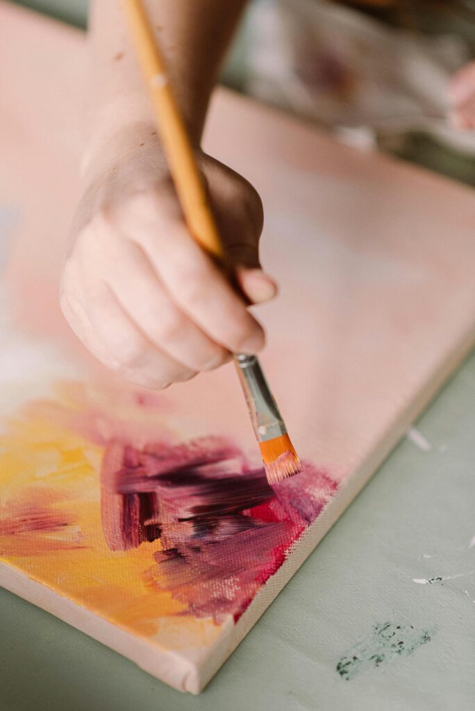
Professional Photos: The Game Changer You Didn’t Know You Needed
You can have the best artwork in the world, but if it’s photographed poorly, no one will see it properly. Crisp, evenly lit photos can completely change how professional your portfolio feels. You don’t need a fancy camera setup, just consistency and good lighting.
Natural light is your best friend. Shoot near a window with soft, indirect light. Avoid harsh shadows or filters that distort colors. The goal is to let your work speak, not to make it “look cool.” If your art involves texture or shine, take angled shots that show it off subtly.
Backgrounds matter too. A messy table or cluttered studio corner pulls attention away from the piece. A clean, neutral surface instantly elevates the image. It doesn’t have to be sterile, just intentional. Remember, presentation is half of perception.
If you can, invest in a short photo session with a local photographer who understands art documentation. It’s not just an expense; it’s a long-term investment in your professional image. Those photos will serve you across your website, press kits, and submissions.
Even if you shoot yourself, consistency matters more than perfection. Use the same lighting style, similar framing, and consistent cropping. It creates a rhythm viewers can trust.
Your artwork deserves to be seen at its best. A well-documented portfolio tells people you respect your work enough to present it properly, and that’s a message every curator or collector notices.
The Subtle Power of Your Contact Page
You’d be surprised how many artists forget to make themselves reachable. A contact page is one of the smallest sections of your site but often the most impactful. It’s where a potential buyer, curator, or collaborator decides whether it’s easy to reach out, or not worth the effort.
Keep it simple: one email address, a short message form, and links to your active social platforms. Don’t list every account you’ve ever made; it looks scattered. Stick to the ones you actually use and keep them updated.
Add a short, friendly note, something like “I love hearing from curators, collectors, and collaborators. Reach out if you’d like to connect!” It makes you approachable without sounding unprofessional. Tone matters here as much as design.
Also, make sure your email actually works. You’d be surprised how many artists use outdated addresses or miss messages because their contact form is broken. Test it every few months just to be safe.
Another smart move is to include a small call-to-action, like linking your newsletter or portfolio PDF. It gives people an extra way to stay connected if they’re not ready to message right away.
A polished contact page signals reliability. It shows you’re organized, responsive, and ready for opportunities, all of which make you look instantly more professional.
Testimonials That Build Instant Trust
When people browse your portfolio, they aren’t just looking for great art, they’re looking for reassurance. They want to know others have trusted you, bought from you, or worked with you successfully. That’s where testimonials work their quiet magic. A single short, genuine quote can do more than a whole paragraph of self-promotion ever could.
The best testimonials feel natural, not staged. Something like “The colors in her work changed my whole living room” lands more impactfully than “She’s a talented, versatile artist.” It feels real, relatable, and grounded. You don’t need dozens; two or three honest ones are enough to create credibility.
If you’ve ever exhibited with a gallery, sold through a platform, or done a commission, ask for a quick line from those experiences. People often say yes, but they don’t know what to write, so make it easy for them. Offer a simple prompt like, “Would you mind sharing a short note about your experience or how you felt about the work?”
Don’t limit testimonials to buyers. A curator who praises your professionalism, or a fellow artist who highlights your reliability, can add just as much weight. It shows you’re not only talented but dependable, a combination curators love.
Visually, testimonials look best when they’re short and framed neatly within your layout. Add a first name, city, or role if possible, “Emma, Collector, London” feels far more personal than a faceless quote.
The secret to strong testimonials is authenticity. People can tell when something feels inflated. Keep them brief, real, and sincere, and they’ll instantly lift your portfolio’s professionalism.
Updating Without Overhauling
There’s this idea that to keep your portfolio “fresh,” you need to redesign it every few months. That couldn’t be further from the truth. Professional artists update with intention, not panic. They know the difference between refreshing content and starting from scratch for no reason.
The key is to treat your portfolio like a living space, not a construction site. You rearrange, dust, and occasionally replace furniture, you don’t demolish the walls every season. Add new work thoughtfully and archive older ones that no longer represent you. Keep the foundation steady.
Set a simple rhythm: quarterly updates work well for most artists. Once every three months, check that your newest series, exhibitions, or features are up. You don’t need to update every single detail, just the ones that matter most for where you are now.
Overhauling too often makes you look unsure of your direction. A stable layout tells visitors that your work, and your identity, has roots. It also helps with SEO, every time you scrap and rebuild, you lose valuable search traction your site has built over time.
If you feel tempted to completely redesign, pause and ask why. Is it because your art has evolved, or because you’re bored? If it’s the latter, play with smaller design tweaks instead, new thumbnails, fresh text spacing, updated bios.
Updating regularly but calmly gives people the sense that you’re active and consistent, two of the strongest professional signals any artist can give.
The Smart Shortcut: Using Templates That Actually Work for Artists
Not every artist wants to learn coding or spend weeks tweaking a website. And honestly, you don’t need to. A great portfolio isn’t about technical mastery; it’s about having the right structure. That’s where a good digital template can save you hours of frustration and instantly elevate your presentation.
The trick is finding one that understands artists, not just generic business templates pretending to fit creative work. You want something clean, image-focused, and built with art visibility in mind. That’s why many artists use the Customizable Digital Portfolio Template for Artists. It’s designed specifically for creatives, with sections for series, bios, contact info, and press mentions that actually make sense.
It’s not just about aesthetics either. The structure helps you organize your story, what to highlight, where to guide the viewer’s eye, how to balance text and visuals. Many artists who switch to professional templates report immediate changes: curators stay longer on their sites, and collectors reach out more often.
Think of it like framing a painting. You could make the frame yourself, but if someone’s already built one that fits perfectly, why not use it? A smart template gives you a solid base so you can focus on your art, not endless design tweaks.
You can still make it yours, change colors, adjust sections, and personalize it with your tone. The beauty is that you start with a foundation that already looks professional. That saves mental energy, time, and even confidence.
A thoughtfully chosen portfolio template doesn’t replace your creativity; it amplifies it. It lets your work shine without distraction, and that’s what real professionalism looks like.
Using Metrics to Understand What’s Working
Professionalism isn’t just about how your portfolio looks, it’s also about knowing what’s actually working. Analytics can sound intimidating, but they’re your best friend when used right. They help you understand what people love, where they stop scrolling, and what makes them click away.
You don’t need to dive deep into data dashboards. Just focus on simple things: how many visitors you get, which pages they visit most, and where they come from. If your “Gallery” page gets tons of clicks but your “About” page doesn’t, maybe your bio link isn’t clear enough. Small tweaks like that can completely change how your portfolio performs.
Think of it as getting feedback without asking for it. Analytics show you the story behind how people experience your work. It’s not about chasing numbers, it’s about using data to make smarter creative decisions.
For example, if your latest series keeps visitors scrolling longer, that’s a hint that it resonates. Or if most visitors drop off on your homepage, maybe it’s too cluttered or loads slowly. Every insight helps you fine-tune your viewer’s journey.
Set a simple routine: check your analytics once a month. You don’t need to obsess, just stay informed. You’ll start to see patterns that make your updates more purposeful.
Professionals know their work, but they also know their audience. Analytics bridge that gap quietly and powerfully, helping you grow without losing your authenticity.

Adding Personality Without Losing Professionalism
A mistake many artists make is thinking professionalism means removing all personality. It’s actually the opposite. The most memorable portfolios feel personal, not in a chaotic, oversharing way, but through small, human touches that make people feel connected.
Your “About” section is a great place to start. Add a short anecdote about why you create the kind of work you do. Maybe you’re drawn to texture because you grew up surrounded by fabrics, or your color palette comes from a particular city or memory. These details stick in people’s minds.
Tone matters too. Write like a human, not like a press release. Phrases like “I love working with…” or “I’m fascinated by how…” feel natural and warm. The goal isn’t to be overly casual, but to sound approachable. When people read your words and feel your energy, they’re more likely to connect with your art.
Even in visuals, small personal cues matter. Maybe you show a photo of your studio corner or your materials in progress. It adds depth without clutter. People love seeing glimpses of the process, it makes your portfolio feel alive.
The trick is balance. Too much personality can feel unpolished; too little can feel distant. Aim for that sweet spot where you’re professional yet real.
Professionalism isn’t the absence of personality, it’s the structure that allows your personality to shine clearly.
Making Your Portfolio Work While You Sleep
A professional portfolio isn’t just a display, it’s a system that keeps working for you, even when you’re not online. Once set up right, it quietly markets your art around the clock. The goal is to make it easy for people to discover, understand, and contact you without your constant effort.
Start by linking your portfolio everywhere: your Instagram bio, email signature, and even your exhibition labels. The more entry points people have, the more visibility your work gains. Don’t rely on social media alone, your website is your permanent home base.
Add an option for visitors to subscribe or download a lookbook. That small addition can turn a casual visitor into a future collector. It’s one of the simplest ways to build long-term relationships through your portfolio.
Also, include your name on every image file and page title. It helps with search engines, so when people Google you, your art actually shows up. SEO isn’t just for marketers, it’s how professionals make sure their work gets found.
Think of automation too. You can set up contact form responses or link scheduling tools for studio visits. The idea isn’t to make your site robotic, but self-sustaining. It should handle the basics while you focus on creating.
When your portfolio quietly attracts opportunities while you’re busy making art, that’s when you know it’s truly professional. You’ve built something that represents you beautifully, and works for you faithfully.