
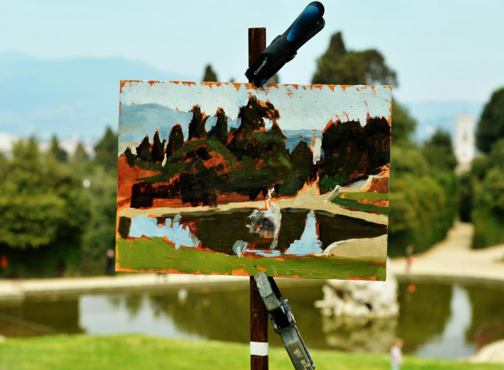
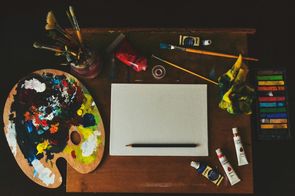
7 Strategies to Build a Minimalistic Yet Attractive Portfolio
Less Can Be So Much More
If you’ve ever stared at your portfolio and felt the urge to add just one more project, or maybe five, you’re not alone. There’s something strangely comforting about packing it full, like you’re proving just how much you’ve done. But here’s the truth: when it comes to showcasing your work, more isn’t always better. In fact, sometimes less is exactly what makes your work stand out.
A minimalistic portfolio doesn’t mean sterile, boring, or empty. It means every image, word, and layout choice has a purpose. It’s a visual exhale. It’s that quiet gallery room with soft lighting and just one artwork on the wall, and yet, you can’t stop staring at it. That’s the kind of power a minimalist portfolio holds.
But how do you create something that feels intentional rather than incomplete? What do you include when you’re including less? And how do you make sure your personality still shines through the clean lines and blank space? That’s where this guide comes in.
1. Start with Fewer Pieces That Speak Louder
When someone opens your portfolio, they’re not looking to see your entire life’s work. They’re looking for clarity, consistency, and impact. So instead of piling on every project you’ve ever done since that first high school mural, choose a small, sharp selection. Think of it like a tasting menu, less clutter, more flavor.
Begin by curating five to eight pieces that truly represent your current voice. If a piece doesn’t make you excited to talk about it in an interview, it probably doesn’t belong here.
If you’re unsure how to decide, look at your work and ask: does this align with what I want to be known for? If you’ve got a dreamy abstract series but secretly want to land more editorial illustration work, choose accordingly.
Here’s one approach: Imagine you’re only allowed to show five works to a dream client. Which ones do you choose? This mindset forces you to evaluate with clarity and purpose, rather than sentiment or volume. Use this thought experiment regularly during refreshes.
And remember, fewer pieces also mean faster loading times, more focus, and less decision fatigue for your viewer. You’re not trying to overwhelm; you’re guiding someone through an experience. Keep it clean, direct, and curated like a gallery.
You don’t need to delete your other work, just don’t lead with it. If it helps, keep an archive or “bonus projects” link off the main page.
2. Make Your Navigation Silky Smooth
Minimalism isn’t only about fewer artworks. It’s also about how people move through your site. A confusing or overdesigned navigation bar? That’s the digital equivalent of walking into a white-walled gallery and bumping into a coat rack.
Stick with clear, clean labels: “Work,” “About,” “Contact.” No clever wordplay needed. Simplicity doesn’t have to be boring, it has to be functional. Your viewer should always know where they are, and where to click next, without pausing to think.
Avoid multiple dropdowns or hidden categories. If your site feels like a puzzle, you’re making your audience work too hard. The fewer decisions they have to make, the better.
Also, don’t underestimate the impact of white space. It creates breathing room. Whether it’s padding around your images or spacing between sections, white space enhances focus.
You might also consider single-page navigation. For many artists, a smooth-scrolling one-page site that jumps between sections like “Selected Work,” “About Me,” and “Get in Touch” can feel incredibly sleek. Fewer pages to load, more time spent looking.
If building your portfolio yourself feels intimidating, platforms like Women In Arts Network offer minimalist, drag-and-drop layouts that take the tech stress out of the equation. Focus on your work, not website code.
3. Let Each Work Tell Its Own Mini-Story
Just showing a pretty picture isn’t enough anymore. Whether you’re a photographer, visual artist, or textile creator, give each project a bit of breathing room with a short narrative.
This isn’t about writing essays. A 2-3 sentence caption under each image or series goes a long way. Share what the work is about, what inspired it, or what challenge you were addressing. It creates connection.
One way to do this: Think of each artwork like a postcard. What’s the one thing someone should know to “get” it? Maybe it was a series created during a long winter of isolation. Maybe it was your first time working in a new medium. That little detail brings depth.
Different artists do this in different ways. One might title works with poetic lines, another might use technical descriptors like “Ink on handmade cotton paper, 2024.” Another might pair a quiet image with a line from a dream journal. Choose your rhythm and stick with it.
But avoid overwhelming with dense text blocks or too many sidebars. The goal is to enhance, not explain. If you’re stuck, ask yourself what you’d want to know if you saw this piece for the first time. That question often leads to the right kind of writing.
Also: formatting matters. Use consistent typography, sizes, and spacing across captions. A minimalistic portfolio works best when nothing distracts from the art, and inconsistent text design is a surprisingly common distraction.
4. Edit Ruthlessly, Refresh Seasonally
A clean portfolio doesn’t just appear once and stay magical forever. A major mistake artists make is letting their portfolios gather digital dust, leaving outdated work sitting next to newer, more refined projects.
Here’s a simple rule: every three to four months, review what’s live. Ask yourself: does this still represent me? Is there new work I’m more proud of? Does anything feel out of place now? If so, update accordingly.
Ruthless editing doesn’t mean throwing everything away, it means prioritizing clarity over nostalgia. That painting you adored five years ago might now feel like an old outfit that doesn’t quite fit. Archive it
Try this cheat: ask a friend or peer to glance through your portfolio in 90 seconds and describe their impression. If they’re confused about your style or direction, that’s a cue something may be muddy. A minimal portfolio should leave no room for confusion.
You can also create seasonal or rotating sections, “Summer 2025 Works,” for example. This allows you to show freshness and create urgency, while still keeping the overall layout minimal. Visitors will feel like they’re seeing something current, not a time capsule.
5. Choose One Visual Style And Stick to It
Nothing breaks a minimalist portfolio faster than inconsistency. You could have the most breathtaking work, but if your thumbnails vary in size, your images are a mix of studio shots and dim-lit phone pics, or your fonts scream in four directions, your impact crumbles.
Decide on one visual rhythm. Maybe you want all images square. Maybe landscape. Maybe you prefer monochrome backdrops. Whatever you choose, stick to it like glue.
Think about color as well. Does your site background clash with your art? Are your navigation buttons loud when your artwork is soft? Treat your portfolio like an extension of your work. Every design choice should reflect your artistic vibe.
One example approach: a photographer might use full-bleed images with no borders and simple sans-serif captions. A collage artist might opt for grid layouts with playful negative space and a serif font. An illustrator might stick to muted tones and gif previews for interactive elements.
Don’t underestimate the power of mockups. If you’re a designer or working digitally, using the same clean mockup template across your portfolio can instantly elevate your cohesion. Tools like Canva, Artboard Studio, or Adobe Express are helpful and often free.
Keep your visual presentation consistent even in how you name your files or title your projects. If one project is labeled “Series: Flora,” the next shouldn’t be “blue sketch thingy lol (finalfinal.jpg).” Treat every detail as part of your work..
6. Add Only the Essentials to Your About Page
Now let’s talk about the “About” section. This is where minimalism can really shine or really backfire. Too often, artists either overshare (life stories, childhood memories, favorite ice cream flavor) or go overly vague (“I create things that make people feel something”). Neither hits the mark.
A strong minimal bio includes who you are, what you do, where you’re based, and one line that reflects your artistic philosophy or process. That’s it. This doesn’t mean cold and robotic, it just means purposeful and clear.
Here’s a template to play with: “I’m a mixed media artist based in Indianai, exploring themes of identity and home through layered materials and repetitive forms.” That one line tells us so much, and leaves space for curiosity.
Consider adding a portrait or candid studio shot to bring warmth without clutter. Black-and-white or neutral-toned images often work best for minimalist layouts, blending into the background while still offering personality.
You should also include a downloadable or linked CV (PDF format), especially if you’re applying to open calls or residencies. But don’t feel pressured to cram your exhibition list into the main page. Keep things separate and scannable.
And for the love of minimalism, please check your spelling. A beautiful portfolio loses instant credibility when typos sneak into your About or Contact info. Triple check.
7. Embed Only One Clear Call to Action
You’ve curated your work, designed with intention, and written a clean, thoughtful bio. But what do you want the viewer to do next? A minimalistic yet impactful portfolio should make that decision effortless. Enter: your call to action.
Don’t clutter your site with multiple CTAs like “Buy My Work,” “Book a Studio Visit,” “Sign Up Here,” “See My Dog’s Instagram.” Choose one. This might be “Email me for commissions,” or “Join my newsletter,” or “See my latest open call entry.”
Placement matters. Embed this CTA subtly but clearly, at the end of your About section, or as a floating button on the home page. It should feel like a natural step, not a hard sell.
Minimalist design thrives on focus. The moment you split your audience’s attention across too many buttons, links, or flashy widgets, you dilute your power. One strong path forward is more effective than five weak ones.
If you do want to include more than one call to action (say, a newsletter and a shop), stagger them. Feature one more prominently, and tuck the other into your footer. Visual hierarchy is your secret weapon.
You can also guide your viewer with subtle prompts. “Curious to collaborate?” or “Want to see more behind-the-scenes?” feels more welcoming than a blinking “CLICK HERE.” Think invitation, not instruction.
The Art of Quiet Confidence
Minimalist portfolios work because they show restraint, and restraint shows confidence. There’s elegance in simplicity. There’s clarity in curation. And there’s real power in knowing that your work, all by itself, is enough.
A strong minimalist portfolio doesn’t happen overnight. It takes editing, rethinking, and a bit of tough love with your older pieces. But what you end up with is a space that gets remembered.