
How to Take Photos of Your Art That Impress Jurors and Buyers
You’ve probably heard artists complain that “my work looks so much better in person.” And yes, that’s true, but here’s the thing, most people making decisions about your art will first see it on a screen. Whether it’s a juror scrolling through applications or a collector browsing online, your photograph is often the first handshake. If that handshake is limp, blurry, or dimly lit, it doesn’t matter how beautiful the original work is, the impression is lost before it begins.
Think about it: when you shop online, do you buy the dress with the grainy photo or the one that looks like it’s glowing right out of the box? Art is no different. The sharper and truer your photo, the easier it is for someone to say yes to you. And while it feels unfair that your brushstrokes have to compete with a camera lens, that’s the reality of the modern art world.
So, here’s the truth: good photos aren’t optional anymore, they’re a baseline. They don’t just show your art, they sell the idea of your professionalism. And people trust professionals. If your photos are sloppy, it whispers that maybe you’re sloppy too. If they’re clean and crisp, they suggest you care about every detail. That little suggestion goes a long way.
The next time you’re tempted to shrug and upload a quick snapshot, remember this: jurors don’t know your studio smells like paint and ambition, they only know what the photo tells them. Make it tell the best story.
Natural Light vs. Artificial Light: Choosing Your Ally
Lighting is the mood-setter of every photo. Get it wrong, and your deep navy looks black or your bright reds look dull. Get it right, and the colors sing exactly the way you painted them. The debate is always the same: do you rely on natural light or invest in artificial? Both have pros and cons, and both can work beautifully if you know how to use them.
Natural light feels like a gift. Place your work near a large window on a bright, cloudy day and suddenly everything glows evenly, no harsh shadows, no yellow tones. It’s free, it’s soft, and it’s incredibly flattering. The catch? It’s also unreliable. If a cloud rolls in or the sun decides to be dramatic, your results shift in seconds. You can spend hours chasing “the right” light only to realize it changes faster than your patience.
Artificial light, on the other hand, gives you control. Once you set up a pair of daylight-balanced bulbs or softboxes, you can shoot at midnight or on a rainy afternoon and get consistent results. But artificial light requires learning. Angle the lamps wrong and your work looks flat or creates shiny hot spots that distract from the art. Many artists give up here, but the ones who stick it out find freedom in that predictability.
Here’s the kicker: the pros often mix both. Natural light for the softness, a little artificial boost for consistency. You don’t need a studio setup worthy of Vogue either, two cheap lights angled at 45 degrees and a tripod can do wonders. The point is not perfection, it’s control. When you control your light, you control how your art is seen.
If you want a quick rule of thumb: use natural light if you’re shooting smaller works and can plan around the weather. Invest in artificial if you need consistency for larger pieces or deadlines. And don’t forget, your phone camera loves light. Feed it enough, and even a smartphone can capture like a DSLR.
Backgrounds: Why They Matter More Than You Think
The background in your art photo is like a frame, it either elevates the work or drags it down. Too many artists underestimate this part. They lean a canvas against a cluttered wall, snap a shot, and then wonder why their piece looks “off.” The truth is, the background tells just as much of a story as the work itself.
Imagine you’re looking at a delicate watercolor on paper. Now imagine it photographed on a wrinkled bedsheet. Instantly, the care you put into the painting is undermined by the chaos around it. On the flip side, a plain wall or neutral backdrop makes the same painting look intentional and professional. This isn’t about being fancy, it’s about respect for your own work.
When jurors flip through hundreds of images, the ones with clean, distraction-free backgrounds automatically rise to the top. Their brains don’t have to fight to find the art, it’s right there. It feels like the artist wanted them to focus, and that’s exactly the message you want to send.
You don’t need a seamless paper roll or an expensive studio wall. A plain white poster board from the craft store works. A freshly painted wall in your home works. Even a large sheet of cardboard covered in fabric can do the trick. The secret is consistency. Choose a background that doesn’t compete with your art, then stick with it.
And here’s a pro tip: think about how your art will look online. White or light gray backgrounds usually blend better into websites and submissions. Busy or dark ones tend to box the work in. You’re not just taking a photo, you’re staging a spotlight.
Framing and Angles: Getting It Right the First Time
Ever notice how a slightly tilted photo makes even the best art look amateur? That’s the curse of bad framing. Your job as the photographer of your own work isn’t just to point and shoot, it’s to flatten reality into something accurate and true. That requires paying attention to angles and edges.
A painting photographed from a slant won’t look powerful, it’ll look distorted. A sculpture shot from too high or too low won’t show its real presence. Jurors and buyers want to see your work, not your shaky camera hand. That’s why the most important tool isn’t your lens, it’s your ability to line things up.
A tripod can change your life here. No more hovering, no more uneven shots. Just steady, aligned frames. If you can’t get one, at least find a way to balance your camera on a stack of books. The steadier the camera, the straighter your lines, the more professional the result.
Angles matter too. For flat work like paintings or drawings, shoot straight on, making sure all corners are aligned in the frame. For 3D work, experiment. Walk around the piece, shoot from several sides, and find the angle that communicates its best story. Sometimes a sculpture shines when photographed slightly below eye level because it gives it presence. Sometimes ceramics look strongest when you show both the form and a hint of the interior.
Here’s the secret: shoot more than you think you need. Pros take dozens of shots just to get one perfect one. You can always delete later, but you can’t recreate the exact same light and mood if you miss it. Give yourself options, then pick the one that looks like your art walked off the wall and into the viewer’s hands.
Editing Without Losing Integrity
This is where many artists panic. They think editing means “lying” about their work. But editing isn’t trickery, it’s correction. Cameras, even good ones, rarely capture colors and tones exactly as your eyes see them. Editing brings the photo back closer to reality, not away from it.
But here’s the trap: over-editing. If you crank the saturation until your blues glow like neon signs, jurors will notice. They’ll see the original later and feel cheated. The goal is faithfulness. Fix what the camera got wrong, but don’t invent colors or effects. The moment someone thinks you’ve exaggerated, you lose trust.
Free tools like Snapseed or Lightroom Mobile make this easy. You don’t need Photoshop mastery, just a light touch. Straighten the frame, adjust exposure so whites look white, and correct any odd color casts. If your photo looks almost invisible, you’ve edited well. The moment your edits start screaming “look at me,” you’ve gone too far.
Here’s a tip : People can always tell which artists respect the integrity of their work because the photos feel honest. That honesty builds credibility before you even walk in the door.
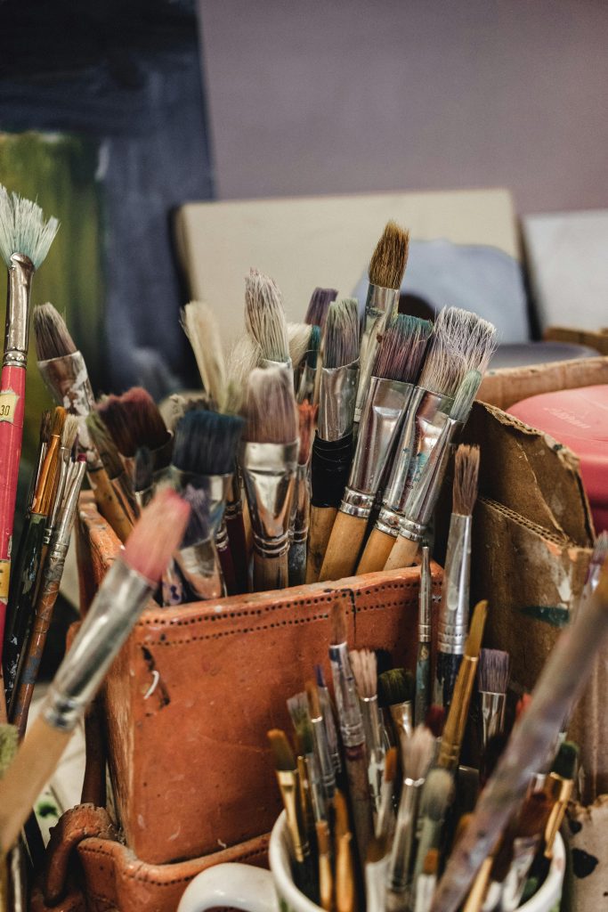
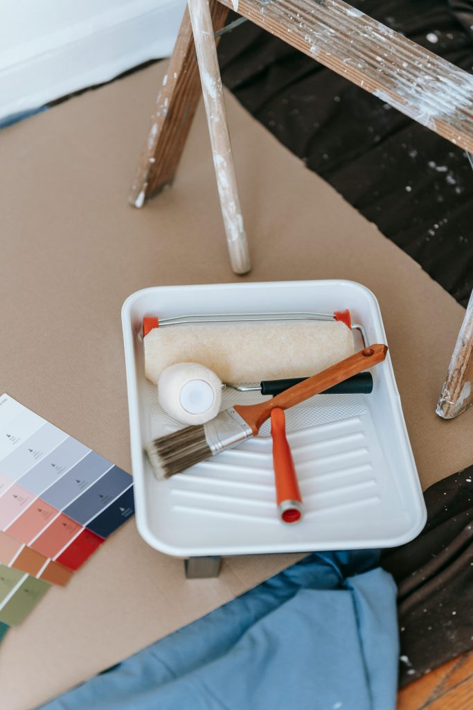
Tools You Actually Need (Spoiler: Not Many)
It’s easy to think photographing your art requires a shopping spree. Fancy DSLR, pricey lights, editing software, the works. But honestly? You probably already have 80% of what you need. The magic isn’t in the gear, it’s in how you use it.
Your phone camera, if made in the last five years, is more powerful than the professional cameras of a decade ago. The sensors are sharp, the colors are accurate, and with enough light, the results are stunning. The difference between amateur and pro isn’t usually the device, it’s the care put into the shot.
That said, a few low-cost additions make life easier. A tripod, even a cheap one, saves you from shaky hands. A couple of daylight bulbs with clip-on lamps can mimic studio light without the studio price. And a clean backdrop, whether that’s a roll of paper or a plain wall, makes your art pop. That’s it. No need to drown in gear.
The real investment is time. Time to notice when light looks best in your space. Time to adjust your angles. Time to take 30 shots instead of 3. People assume pros have secret equipment, but more often they just spend more minutes setting up than the rest of us.
If you want proof, scroll through Instagram. The artists whose work always looks sharp and professional? Nine out of ten times, they’re not using thousand-dollar cameras. They’re using intention, patience, and the simplest tools they can manage well. That’s your best bet too.
The Secret Power of Natural Light
Natural light can be your best friend when photographing art, but it can also be a tricky guest to manage. Too much direct sunlight and your work looks washed out, too little and everything looks muddy. The sweet spot is usually a soft, even light , think early morning or late afternoon. That’s when the sun is kind enough not to throw harsh shadows all over your work. Position your piece near a window with sheer curtains, and you’ll see the difference immediately.
One mistake many artists make is thinking that a sunny day automatically means better photos. In reality, direct sunshine can create bright spots, reflections, and glare that distract from your art’s details. Instead, aim for cloudy or slightly overcast conditions. The clouds act like a giant diffuser, spreading light evenly across your canvas or sculpture. That way, every brushstroke or texture is visible without distractions.
If you’re shooting indoors, find the brightest room in your house and make it your photo studio. Pull your art close to a large window and pay attention to how the light falls across it. You might need to move the piece around until you find the perfect spot. And remember, if the light looks good to your eyes, it will probably look good to the camera too. Don’t overcomplicate it.
Of course, natural light changes quickly, which means you need to work fast. What looks perfect at 3:15 might look dull by 3:45. The trick is to know when the light in your space works best and schedule your photography around that time. It takes a little practice, but once you learn your room’s rhythm, it becomes second nature.
Another tip is to avoid mixing natural and artificial light. If you’re near a window, turn off any lamps or overhead lights. The camera gets confused when there are multiple light sources with different colors, and the result is often weird, uneven tones. Stick with one consistent source for cleaner, more professional shots.
And if you want to level up without spending much, grab a piece of white foam board. Place it opposite your window to bounce light back onto the darker side of your work. Suddenly, your art looks evenly lit without the need for extra gear. It’s a simple hack that photographers swear by and artists can easily borrow.
The beauty of natural light is that it gives your art an authentic, true-to-life look. No one wants to see a painting that looks yellow indoors and blue outdoors. By leaning into natural light, you’re showing your work the way it deserves to be seen.
Editing Without Overdoing It
Once the photos are taken, the temptation to “fix” them can be overwhelming. A little brightness here, a touch of contrast there, and suddenly you’ve gone too far. The goal of editing is not to transform your art but to make sure the photo matches reality as closely as possible. Remember, you’re editing the photo, not the artwork.
Start with the basics: crop, straighten, and adjust exposure. Cropping gets rid of distractions like a bit of wall or floor peeking into the frame. Straightening ensures your painting doesn’t look like it’s leaning to one side. Adjusting exposure helps balance out shadows or highlights that didn’t translate well in the shot. These small fixes already make a world of difference.
Color correction is where things can get tricky. Maybe your camera made a warm beige look too orange or turned a deep blue into something almost neon. This is where editing software like Lightroom, Snapseed, or even your phone’s default tools can help. Adjust the white balance until the photo reflects what your eyes see when you stand in front of the actual piece.
The key is restraint. If you find yourself playing with sliders for more than five minutes, you might be drifting away from reality. One way to keep yourself honest is to put your art in front of you and compare it directly to your screen. If the digital version doesn’t match the physical piece, step back and reset.
There’s also a difference between editing and enhancing. Editing is about accuracy, while enhancing is about making something look better than it is. Resist the urge to make your colors pop more than they do in real life. A juror or buyer will be disappointed if they fall in love with a photograph only to find the actual work looks nothing like it.
Think of editing as polishing, not repainting. You’re removing dust and fingerprints so the artwork shines on its own. A clean, accurate photograph communicates honesty, and honesty is what builds trust with your audience. Over-edited photos, on the other hand, often backfire.
At the end of the day, the best editing job is the one no one notices. If your photo looks natural and true, you’ve done it right.
Framing the Shot Like a Storyteller
How you frame your art in the photo can change how people connect with it. A head-on, centered shot is a classic approach, but sometimes a little creativity adds personality. Think about what story you want the photo to tell. Is this piece bold and commanding? Then a tight, centered frame works. Is it delicate and inviting? A slightly wider shot that shows some negative space might suit it better.
When photographing paintings, keep the edges sharp and parallel. Nothing is more distracting than a crooked frame that makes a square canvas look like a trapezoid. Most editing tools have a perspective correction option if you didn’t nail it while shooting. Take the extra minute to fix it , it’s worth it.
For 3D works like sculptures or ceramics, multiple angles tell the story better. One straight-on photo might not capture the curves or textures. Shoot from slightly above, from the side, or even from below if it adds drama. Think of it like giving the viewer a mini gallery tour through your lens.
Negative space can be your friend. Leaving some breathing room around your artwork makes the photo feel balanced and polished. Don’t crop so tightly that the piece feels cramped. Let it sit comfortably in the frame, as if it’s on display in a room.
Another thing to consider is scale. Sometimes adding a subtle reference point, like a hand placing the piece on a wall or a plant in the corner, gives viewers a sense of size. Just make sure the reference doesn’t steal attention from the art itself. It should complement, not compete.
The frame of the photo is not just a boundary, it’s part of the presentation. A well-framed image says you thought about how your audience will experience the work. That extra thought shows professionalism and care.
Shooting 3D Work Without Losing Dimension
Photographing 3D work is a whole different challenge compared to paintings. A single flat photo rarely captures the depth and detail of a sculpture, installation, or textile piece. That’s why variety is key. Don’t settle for one photo, think in terms of a series that together tells the full story of your work.
Start with a clean, well-lit environment. Sculptures, in particular, cast interesting shadows, which can be both a blessing and a curse. The right light brings out texture, while the wrong light hides important details. Experiment with moving the light source around until you get shadows that enhance rather than obscure.
Angles matter a lot more in 3D photography. A sculpture might look powerful from below but ordinary from above. Try shooting from multiple points and study which angle communicates the piece best. This can be surprising , sometimes the angle you least expect is the one that makes the work shine.
Texture is another element that can get lost in photos. A ceramic surface, a fabric weave, or the layers of mixed media all need to be captured clearly. Close-up shots are a great way to highlight texture. Pair them with wider shots so viewers get both the overall impact and the finer details.
If your work is wearable or functional, show it in action. Photograph jewelry on a model, textiles draped over furniture, or pottery in use. These lifestyle shots don’t replace your main photos, but they give context and help viewers imagine how the piece fits into real life.
Don’t shy away from taking too many photos. With 3D work, you’ll likely need more attempts to get it right. The beauty of digital photography is that you can sort and delete later. What matters is having enough options to choose the shots that truly represent your art.
Photographing in Different Environments
Sometimes the best way to showcase your art is to take it out of the studio. Context adds layers of meaning, and photographing your work in different environments can completely change how people perceive it. A painting photographed against a gallery-style wall feels formal, while the same painting in a cozy living room setup feels approachable. Both are valid, and both tell a story.
Outdoor settings can also work wonders, especially for large or nature-inspired pieces. The trick is to make sure the background doesn’t compete with the artwork. A sculpture in a garden can look harmonious, but a sculpture in a busy park might just get lost. Choose locations that enhance your work’s personality rather than overwhelm it.
Minimalist environments often photograph best. A clean wall, a simple floor, or a neutral backdrop lets the art take center stage. If you add props, be intentional. A chair, a vase, or a plant can set the mood, but too many props distract from the art. Think of them as supporting actors, not stars of the show.
Changing environments can also reveal new sides of the same piece. A canvas under warm lamplight might feel intimate, while under bright gallery lighting it feels bold. Try photographing your work in at least two different contexts, so you have options depending on where you’ll use the image.
This approach also makes your portfolio more versatile. If you’re applying to a residency, a clean studio shot might be best. For Instagram, a styled photo in a home environment might resonate more. Having both allows you to speak to different audiences without redoing the photography from scratch.
Ultimately, environment photography is about storytelling. Where you place your art shapes how people imagine it in their own lives. And when people can see your work fitting into their world, they connect to it more deeply.
Putting It All Together
Photographing your art might feel like a side chore, but in reality, it’s one of the most powerful tools you have as an artist. These images are the bridge between your studio and the world. They’re how jurors, curators, and collectors experience your work before they ever see it in person. Done well, photography doesn’t just document your art, it elevates it.
The good news is, you don’t need to be a professional photographer to get professional-looking results. With attention to lighting, framing, and editing, you can create images that represent your work honestly and beautifully. The key is consistency. The more you practice, the more natural the process becomes, and soon it won’t feel like a burden but another creative extension of your practice.
It’s also worth remembering that no one gets it perfect on the first try. Even professional photographers take dozens of shots before landing on the right one. Give yourself permission to experiment, fail a little, and learn along the way. Your art deserves that effort, and you’ll see the payoff when opportunities start coming your way.
Don’t underestimate the power of presentation. A strong portfolio with clean, accurate images sets you apart instantly. It shows professionalism, care, and respect for both your work and your audience. In a sea of submissions, that kind of attention to detail can be the thing that tips the scale in your favor.
As you put these tips into practice, think of your camera as another brush in your toolkit. It’s not about changing the art, it’s about framing it in a way that others can truly see. And when people can see your art clearly, they can connect with it, value it, and remember it.