Ligia Fascioni on combining photorealism with hand-drawn floral elements

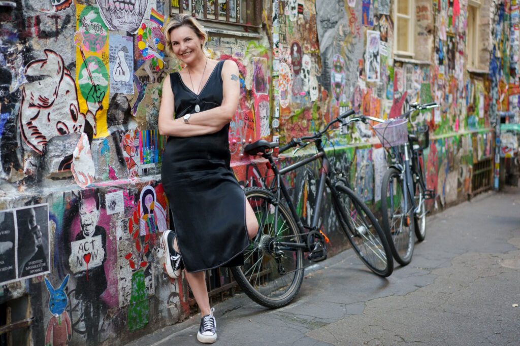
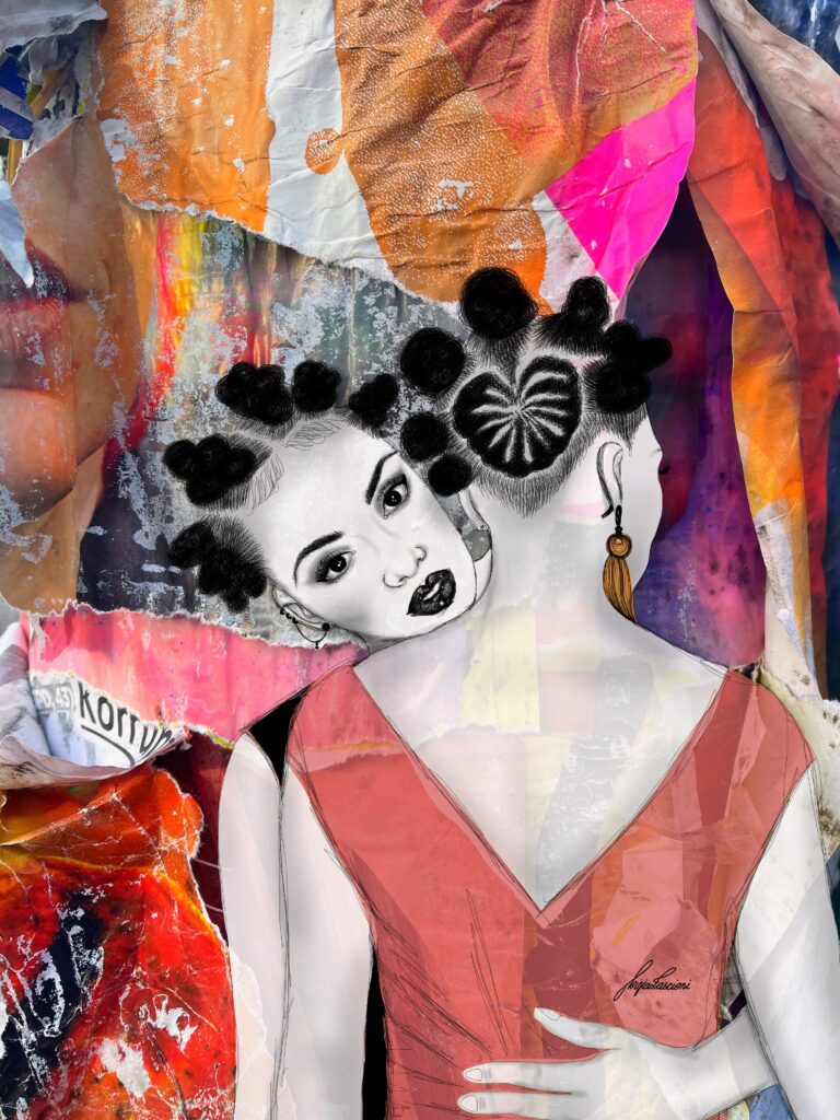
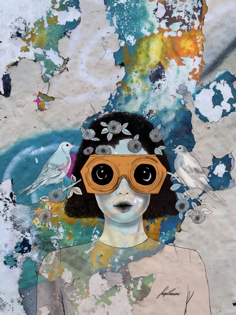
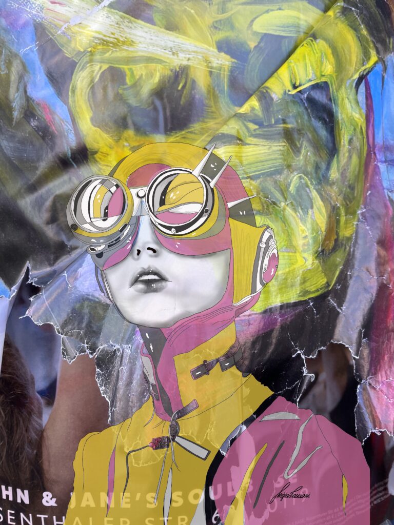
At Women in Arts Network, we keep saying that Faces is about what sits underneath the surface. But Ligia Fascioni took that literally. She builds her faces on top of actual surfaces, the graffiti-covered remains of the Berlin Wall, the torn posters layered on Berlin streets, real textures from real history, and draws powerful women right on top of them.
Ligia is a selected artist for the Faces exhibition and the moment we saw her work we understood something about faces that we hadn’t considered before. That every face is built on layers. Not just emotionally. Historically. Culturally.
Every woman walking through the world is carrying layers of history underneath her skin, generations of it, and Ligia makes that visible by literally building her portraits on top of layers of history.
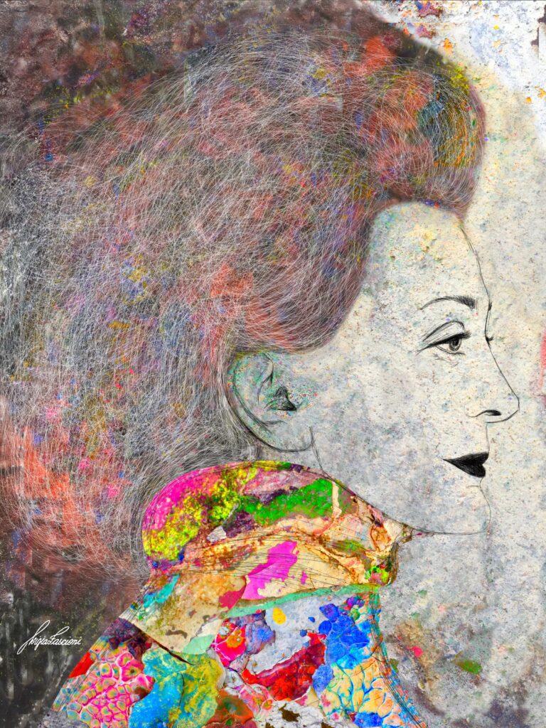
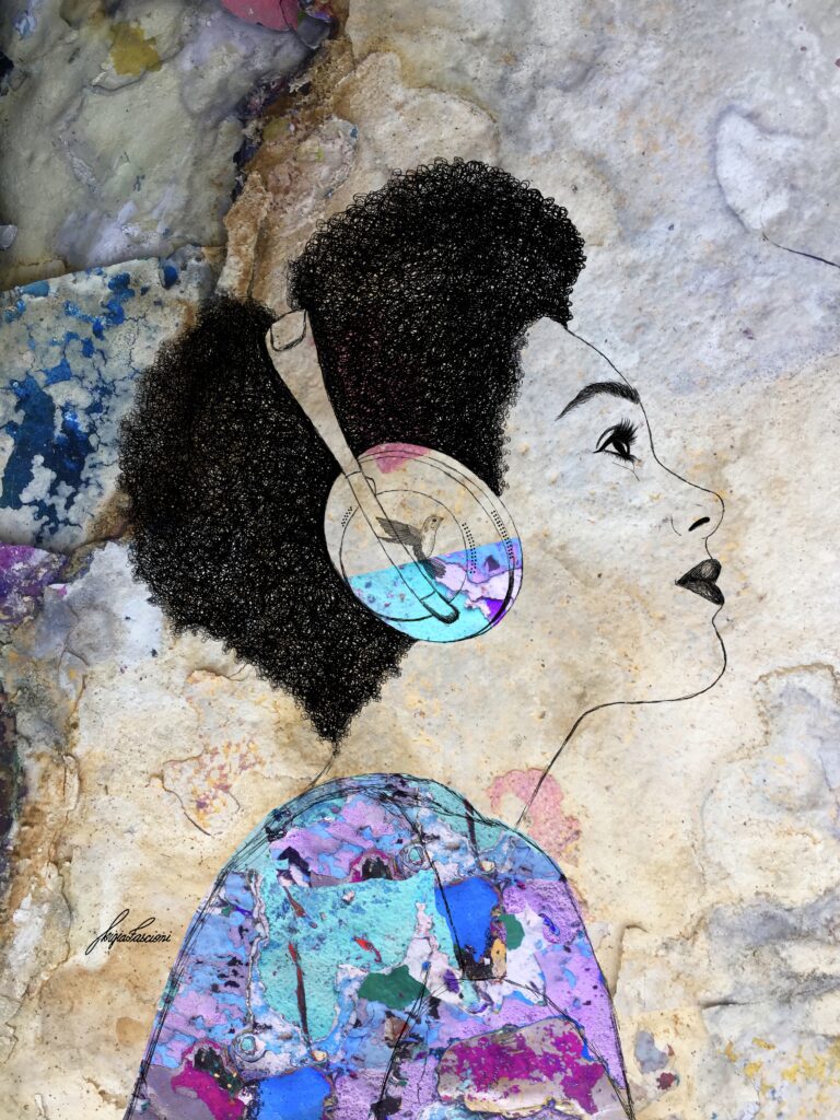
She photographs the peeling graffiti shells of the Berlin Wall. The torn street posters that reveal colour after colour underneath. Surfaces most people see as decay or mess. And she sees foundations.
Starting points. Material that carries weight and story and decades of human experience in every crack and tear. Then she draws women over them. Digitally illustrated, every ethnicity, every body type, every age. Always powerful. Always complex. And always inseparable from the layers beneath them.
The colours in her work are real. Not chosen from a palette. Photographed from walls and streets. That’s the part that changes how you see everything. When someone tells you those pinks and blues and yellows aren’t painted, they’re the actual surface of a wall that once split a city in half, suddenly the woman drawn on top of it carries a different kind of weight. She’s not just a portrait. She’s a statement about transformation. About what women do with the broken things they’re handed.
Ligia came to this from an unexpected place. She trained as an electrical engineer. Worked in the technical world for years. Then completed a doctorate in Design Management and started teaching. She studied colour theory and composition and visual communication the way an engineer studies systems, methodically, precisely, always asking how does this work and why.
That mind is in every piece she makes. The complexity is intentional. The layering is structural. Nothing is decorative for the sake of being decorative. Every element is doing a job.
She cites Gustav Klimt as her biggest inspiration and the connection makes immediate sense. The richness. The ornamentation that isn’t ornament but meaning. The belief that more layers don’t create confusion, they create depth. Ligia works the same way. Her pieces reward the viewer who looks longest. The more time you give them the more you find.
She lives in Berlin and the city isn’t just her home, it’s her material. Every cracked wall and torn poster is potential. Every surface the rest of us walk past without noticing is something she photographs and transforms into the foundation for another woman’s face.
Now let’s hear from Ligia, about building portraits on the ruins of the Berlin Wall, about transformation and torn posters and the layers we all carry, and why the most powerful face might be the one built on top of everything that tried to break it.
Q1. Can you share how your early training in graphic design shaped the way you think about structure, clarity, and communication today?
Actually, I’m an electrical engineer by training and experience, but I’ve always been interested in art. Coming from a technical background, I found it easy to learn digital tools from the earliest versions. My interest grew to the point that, after a few years, I completed a doctorate in Design Management. Only then did I begin to study the subject more deeply, including teaching undergraduate and graduate courses. Even with a more business-oriented focus, studying the fundamentals of graphic design helped me a lot to understand color theory, composition, gestalt principles, textures, balance—elements that greatly helped me to materialize what I had in mind and wanted to convey.
Q2. You emphasise that design should solve problems, not decorate them. How do you determine whether a project truly needs design intervention or a different kind of thinking altogether?
Thinking about how to solve problems more efficiently, but primarily considering the user’s point of view, is thinking about design; from this perspective, I believe design is always necessary. Regarding the decorative aspect, design needs to understand the point of view of those who will benefit from the solution – and the aesthetic aspect (that is, the one related to all our senses) is always important when we are dealing with human beings. We perceive the world through our senses – that said, they need to be considered in all the interventions we make. Sometimes, the intention of the project is simply to create well-being, pleasure, and joy – in which case, some may interpret this as frivolous. But these feelings and perceptions are important to human beings and directly impact their quality of life. So, often, decorating is about solving problems. And, regardless of the solution developed, the human-symbolic aspect, the perception, the impact on the senses – should always be considered. That is design.
Q3. Many clients come to you with complex or confused identities. What is your process for identifying the core message before any visual decisions are made?
The confusion between a company’s image and its identity is quite common and normal. This happens because these concepts are not well defined within the business world, and even marketing and communication professionals often use them interchangeably. I was able to study this in depth in my doctoral project—I created a method that measured the difference between the two aspects. Identity is what the company truly is—we could say it’s its DNA. It’s a set of attributes that define its essence. It’s not what its founders would like, it has nothing to do with what the market wants, and it doesn’t depend on external factors. Identity is essence and doesn’t change over time—on the contrary, it becomes increasingly refined. Image, on the other hand, is how the public sees the company. I like to use analogies to make it easier: identity is what the company truly is—we could represent it as a painting. Image, however, is inside the head of each person who interacts with the company.
The image is like a puzzle that the person assembles in their mind trying to reproduce the original, according to the pieces they collect.
These puzzle pieces are precisely the design – all the ways the company uses to express itself and present itself to the world: the graphic brand, actions and communications, colors, style, language, policies, interviews, advertising, etc. If the company doesn’t know its essence, doesn’t know who it is, it ends up distributing disconnected pieces. It follows trends, but when a person tries to assemble these pieces in their own mind to form the company’s image, they don’t fit together. This generates noise, insecurity, and causes the company to lose credibility and reputation. My method consists of a workshop with a representative sample of the company – from directors to the lowest-ranking positions (who are never invited to this type of activity). The identity is translated from the company’s culture – it’s the DNA present, but not decoded. Therefore, no one is more suitable than its employees, at all levels, to help discover it. The question “who is the company?” is asked exhaustively, using various techniques, until consistency and repetition are identified – contradictions are recognised and carefully analyzed. Finally, the company receives a detailed report concluding with a “corporate identity statement” summarized by a set of adjectives that define it.
Q4. You work with systems rather than isolated visuals. How do you ensure consistency across different platforms while keeping identities flexible?
The key to consistency is always knowing your own identity. If a company, for example, has tradition as its core element, it’s pointless to jump on the next TikTok trend or try a language completely foreign to its essence, just to appear more connected. In this case, the ideal is to recognize your identity as a differentiator and seek consumers who value this aspect – even considering it essential in their purchasing decisions. The match between company and client happens through identity – both parties recognize themselves as alike – they admire each other. It doesn’t matter if that aspect is fashionable or not; what matters is that the client recognizes themselves in the company’s essence. In this way, it becomes much easier to make decisions, not only about design, but also about other things: launching new products, customer service style, campaigns, strategic or investment decisions, work policy, etc. If the elements of the identity are used as a reference, the path is clear and there is no room for doubt.
Q5. Some of your pieces require viewers to read, pause, and follow sequences. How important is time and attention in the way your artworks are experienced?
I really enjoy working with layers; I believe that human beings are formed by several of them, both physical and psychological. In my work, I try to translate this using photos of the graffiti shells from the Berlin Wall as a background for my drawings of women. They are of all ethnicities, cultures, body types, and ages—but always powerful and complex in their layers. The colors reflect beauty and diversity—for me, the interesting thing is to show that it’s possible to transform the horror that was that wall into something beautiful and poetic. Later I started doing the same using overlapping layers of street posters—I photograph the torn posters that reveal the various colors. These are also layers of history and may be seen as dirt or ugliness at first glance. But women have the power of transformation—and I always try to use that as the starting point of the composition.
Q6. Your artworks often resemble diagrams, maps, or visual explanations. How intentional is that resemblance, and what does it allow you to communicate that traditional imagery would not?
The complexity is intentional, as I believe it better reflects human nature. For me, the key to my work is recognizing the layers—of history, of colors, of context. Whether it’s peeling graffiti or torn posters, the overlapping allows for different readings and interpretations. I love minimalist drawings and admire the talent of those who can communicate so much with so little—but I am not a minimalist artist. My main inspiration is Gustav Klimt.
Q7. Have you encountered resistance from clients when prioritising clarity over visual trends? How do you handle that?
If the question relates to my work with corporate identity, this resistance is very common, as the concepts aren’t always clear in the client’s mind. I always start from the principle that, while I was studying design, the client was honing their skills in a different area. Therefore, it’s completely understandable that they don’t have clear and defined concepts and confuse trends with the need to update and position themselves. A good conversation explaining the principles upon which decisions should be made makes everything clearer. When the person understands the reasons why, they begin to understand the path and make more coherent decisions. It usually works well.
Q8. You’ve written and spoken extensively about design and communication. How does articulating your thinking in words affect the way you practice design?
I’m very careful when I write—I always try to base my claims on some study, article, or book. So, writing about these things is also an opportunity to learn more. This tremendously affects my work—I believe that studying is one of the things I enjoy most in life. Sharing what I’ve learned is another of those things. For me, it doesn’t make sense to learn if you don’t share it with others. Writing makes us research and reflect on our beliefs, as well as question our certainties. It’s very satisfying.
Q9. What kinds of communication challenges interest you most right now cultural, organisational, or technological?
I believe that all these forms are intrinsically linked and equally challenging. We are going through a disruptive moment in human history with the integration of generative artificial intelligence into our daily lives. We will have to learn to deal with this new element, without harming our cognitive capacity and decision-making abilities. I fear we are not prepared for the challenge. That’s why this topic interests me so much, and I read a lot about it. It’s terrifying, intriguing, and exciting all at once. These are interesting times to be alive.
Q10. Looking across your body of work, what visual strategies or formats do you return to most often and why?
Look, I don’t work professionally as a graphic designer – I teach courses and workshops and study a lot so that the information reaches the other side in the most didactic and clear way possible. When defining a company’s corporate identity as a consultant, I usually try to delegate the task of translating that identity graphically to an experienced and qualified professional in that area. It’s a teamwork. Regarding my work as an illustrator, people are intrigued by the mix of techniques – digital illustration and photographic montage. When they learn that all those colors and shapes are real and come from such a historic and special place as the Berlin Wall, or even the posters they see every day on the street – the magic happens. Because they realize that it’s possible to see the world in other ways, even while experiencing the same everyday landscapes. That makes me very happy.
Q11. What advice would you give to artists who want to create work that communicates ideas clearly, without relying on expressive or symbolic imagery?
Personally, I see no problem in using expressive and symbolic imagery. I believe the most important thing is for the artist, just like a company, to know their essence, their identity. There are no better or worse identities, only different ones. Once they know what defines them, what moves them, it’s up to the artist to simply translate that visually. If the solution comes in the form of clichés, I see no problem with that. I believe that coherence with oneself is more important than external opinions. There will always be an audience that identifies with this language and feels represented by it, giving it its due value.
Talking to Ligia does something to the way you see the world afterwards. You walk outside and suddenly you’re looking at walls differently. The peeling paint on the building across the street. The torn poster on the lamp post. The graffiti fading on a bridge. You start wondering what’s underneath. What layers of colour are hiding behind the surface everyone else has decided is ugly or finished or not worth looking at.
That’s what Ligia’s work does to you. It rewires your eyes. Not just for art. For everything.
Because isn’t that what we all need? Someone who looks at the thing everyone else has written off and says no, there’s something here. There’s beauty in this. There’s story in this. It just needs someone willing to look long enough to find it.

That’s what she does with walls. And that’s what her work does with women. She takes the complexity, the layers, the contradictions, the history we carry in our skin and our bones, and instead of simplifying any of it she builds on top of it. Adds more. Adds colour. Adds life. Until the whole thing is so rich and so layered that you could stand in front of it for an hour and still find something new.
She came from engineering. From systems and structures and problem-solving. And she brought all of that precision into art without losing any of the feeling. That combination is rare. Most artists are all instinct or all technique. Ligia is both. Every composition is intentional and every layer is emotional and the two don’t fight each other, they hold each other up. The way Klimt’s ornamentation holds his figures. The way history holds the women Ligia draws on top of it.
For anyone who collects or lives with art, her work offers something unusual. A piece that looks different every time you see it. Not because it changes but because you do. The layers reveal themselves slowly. The colours shift depending on the light. The history underneath starts to feel heavier or lighter depending on what kind of day you’re having. That’s work that lasts. Not work that impresses you once. Work that keeps talking to you for years.
If Ligia’s journey reminds us of anything it’s that the most interesting things are never on the surface. They’re underneath. Layer after layer after layer. And the person willing to dig, to photograph the torn poster and the cracked paint and the graffiti nobody wanted anymore, that’s the person who finds what the rest of us would have walked right past.
To follow Ligia’s journey and see more of her work, find her through the links below.