
How to Build a Press Kit Curators Actually Use
If you’ve ever tried explaining your art practice in an email and felt it came out all wrong, you already know why a press kit matters. It’s not about being fancy or looking “professional,” it’s about helping people understand your work without making them dig for it.
A good press kit isn’t something you make once you’re established, it’s something that helps you get established. It’s what makes it easier for curators, editors, or collaborators to say yes because they can actually see who you are, what you make, and where you’re going.
Most artists think their Instagram or website already covers that. But when someone is on a deadline or considering you for a show, they don’t have time to scroll through posts or guess your timeline. They need a single, clear snapshot that connects the dots fast , your story, your work, your highlights, your contact.
Think of a press kit as your “ready file.” The thing that speaks for you when you’re not there to explain yourself. It’s not about selling; it’s about clarity. It shows that you take your work seriously enough to make it easy for others to do the same.
And the best part? Once you build one properly, it keeps working quietly in the background , sending opportunities your way while you focus on the real work: making art.
Start With What You Already Have
Most artists delay making a press kit because they think they need to have a big list of exhibitions or publications first. But that’s not true. You already have what you need , your work, your words, and your intent. The trick is to put them together in a way that’s easy to read and makes sense to someone who doesn’t know you yet.
Start by gathering your materials: your artist statement, bio, CV, and 5–10 strong images of your work. Don’t overthink it. Even if your CV feels short or your statement still feels like a draft, that’s okay. This first version isn’t about perfection; it’s about clarity. You’re creating a foundation that you can refine as your career grows.
The most important thing? Make sure everything reflects who you are right now, not who you were five years ago. Old bios and early work can confuse people about your current direction. Update, delete, simplify , whatever it takes to make your press kit feel like a snapshot of your present, not your past.
If you’re just starting out, highlight your current projects instead of exhibitions. Mention collaborations, community work, or even online showcases. Anything that shows engagement counts. People want to see movement, not just milestones.
Think of this step as cleaning your creative house. Once everything’s gathered and aligned, you’ll already feel more organized , and that energy translates directly into how curators experience your work.
Tell Your Story, Don’t Recite Your Resume
A press kit isn’t just a list of achievements; it’s your story told through facts. A curator doesn’t just want to know what you’ve done, they want to understand why you do it and what connects it all together. Your artist statement is where that comes through.
Avoid buzzwords and filler phrases. Instead of saying your work “explores the intersection of,” say what you actually do. For example, “I paint everyday rituals because I’m fascinated by how small actions hold emotion.” That’s real, direct, and memorable.
Your bio should do the same thing. Yes, include where you’re based, what you make, and any key highlights, but weave it in naturally. If you’ve shown in local collectives, say so. If you studied something unrelated but it shaped your practice, that’s worth mentioning too. People love honesty more than polish.
The difference between a resume and a story is context. Your story helps people feel your work before they even see it. When your writing sounds like you , calm, clear, and unforced , people trust you more.
Think of your statement and bio as your introduction in a room full of strangers. You don’t need to impress them in 30 seconds; you just need to make them curious enough to want to see more.
Choose Images That Speak Without Overcrowding
Your visuals are the heart of your press kit, but most artists make one of two mistakes: either they include too few or they overwhelm the reader with too many. A curator doesn’t need your entire portfolio, they need a selection that shows your essence.
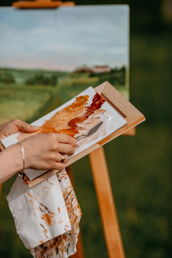
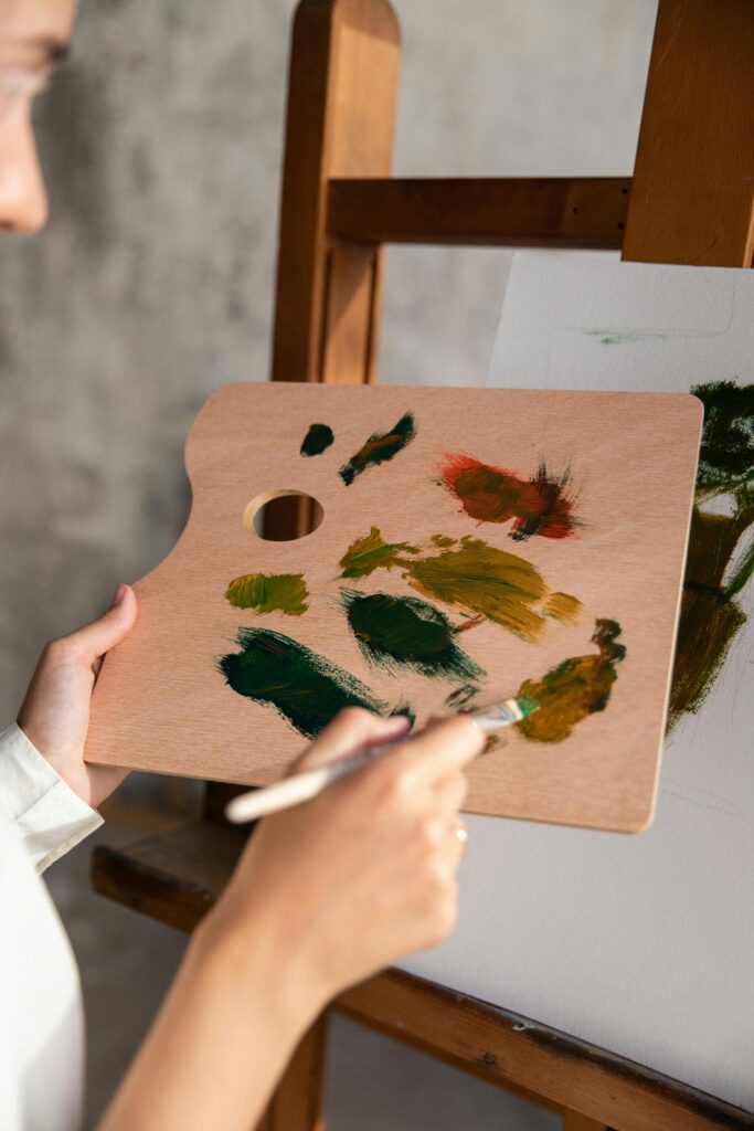
Pick 5–10 high-quality images that represent your strongest, most recent work. Make sure they’re consistent in lighting, size, and presentation. If you photograph your own work, use natural light, neutral backgrounds, and avoid distractions like clutter or shadows. It sounds simple, but clean visuals instantly make your practice look professional.
Each image should have a caption: title, medium, size, and year. Optional, but powerful: add a one-sentence context line for complex works. Something like, “From the series exploring daily memory rituals,” adds meaning without over-explaining.
Don’t mix unrelated projects in one folder. If your practice spans painting and installation, create subfolders or separate press kits. That makes it easier for curators to find what’s relevant.
And finally, name your files clearly. Instead of “IMG_1234,” label them “Julia_Roberts_WorkTitle_2025.” It’s a small act that quietly communicates care , the kind of professionalism people notice even if they never mention it.
Curate Your Highlights Like an Editor, Not a Fan
When you start listing your exhibitions, awards, and press features, it’s tempting to include everything. But that can make your press kit read like a shopping list instead of a story. What you leave out often says as much as what you keep in.
Choose highlights that reflect the direction you’re moving toward, not just where you’ve been. If your work is shifting toward installation, lead with recent group shows or projects that align with that. A five-year-old printmaking award might be less relevant than a small but current exhibition that better represents your voice.
Chronological order still matters, but lead with quality, not quantity. Curators appreciate artists who can self-edit , it shows you understand how to frame your own narrative. It also makes their job easier, which goes a long way in professional settings.
If you don’t have formal exhibitions yet, list creative milestones that show initiative: collaborations, pop-ups, zines, online showcases. The art world is expanding beyond gallery walls; your press kit should reflect that too.
Remember, your highlights are not a competition scoreboard. They’re simply context for your growth. Present them like a timeline of curiosity and effort, not just achievements.
Create a “One-Click” Experience
The best press kits feel effortless to navigate. You don’t want curators digging through layers of folders or links. Whether you’re building a PDF or a Notion page, design it with simplicity in mind. Everything should be accessible within one or two clicks , statement, visuals, bio, CV, and contact.
If you’re going digital (and you should), make your PDF interactive. Add clickable links to your website, social media, or video works. Include your contact information on every page so it’s impossible to lose. Think of this as designing a user experience, not just a document.
Layout matters too. Use clean fonts, consistent spacing, and clear headings. White space is your friend , it helps your work breathe. Avoid backgrounds, borders, or heavy graphics unless they’re part of your visual identity.
If design isn’t your strong suit, don’t worry. The Customizable Digital Portfolio Template for Artists from Arts to Hearts Project gives you a ready-made, elegant framework you can tailor to your brand. You just drop in your content , it handles the flow, layout, and design polish for you. It’s perfect for building a press kit that looks intentional without spending hours figuring out formatting.
A clean, clickable press kit doesn’t just look good , it feels good to navigate. It tells curators that working with you will be smooth, which is one of the quietest but most powerful impressions you can make.
Write a Bio That Sounds Like You’d Actually Say It
The most common mistake artists make is writing bios that sound like they’ve been written by someone else. They’re either too stiff (“Her work explores the complexities of…”) or too vague (“I’m an artist passionate about creativity”). Both lose what makes you distinct.
Start by speaking your bio out loud. How would you describe your work to someone curious but unfamiliar? That’s your real tone. Write it the way you’d naturally say it , clear, grounded, and with a touch of personality.
Include the essentials: your name, location, main medium, and what your work focuses on. Then, if relevant, add education, exhibitions, or projects. But don’t overload it. A few strong sentences can do more than a paragraph full of jargon.
The trick is balance , informative but warm, confident but not performative. Imagine your bio as your handshake in written form: firm, clear, and genuine.
When your bio sounds like you, it makes your whole press kit feel human. And that’s what curators connect to , not just your work, but the person behind it.
Keep It Simple, Make It Scannable
A curator might be flipping through twenty press kits before lunch. Yours doesn’t need to be the flashiest, but it should be the easiest to navigate. Think of it like designing a room, if someone can’t find the exit, they’ll stop exploring. Every section of your kit should be clearly labeled and easy to scan: bio, artist statement, portfolio highlights, contact info, and press links. That’s it. Clean layout, no walls of text, no mystery buttons.
Avoid stuffing everything you’ve ever made into one file. Instead, curate your own work with the same care a gallery would. Three to five strong images per project are more than enough. Remember, you’re showing taste, not quantity. A curator will always remember a portfolio that felt calm and intentional over one that screamed for attention.
And please, no huge PDFs that take minutes to load. If it’s clunky, it’s forgettable. Compress your files, test your links, and make sure everything opens smoothly on desktop and mobile. These small details quietly communicate professionalism, and that’s something every curator notices.
If design isn’t your thing, use a ready-made artist press kit template like this customizable digital portfolio template. It helps you organize and polish your materials without getting lost in formatting. You focus on your art, it takes care of the presentation.
Once your kit looks sharp, have a friend test it. Ask them if they could find everything easily and if it “feels” like you. Their reaction will tell you more than any checklist ever could.
Tell a Consistent Story Across Every Piece
Your bio, artist statement, and visuals should feel like they belong to the same person. That doesn’t mean repeating yourself, it means creating harmony. If your work is raw and emotional but your bio sounds like an academic paper, the curator will feel a disconnect. Same goes for visuals: don’t mix moody portraits with bright, playful graphics unless that contrast is intentional.
Think of your press kit as a movie trailer. Every part should point to the same message: who you are as an artist, what you care about, and why your work matters right now. You’re not trying to impress everyone, just the ones who “get it.”
A simple trick: read your statement out loud. Does it sound like how you’d describe your work in conversation? If not, rework it until it does. The most effective press kits sound like a person, not a brochure.
Once you align your tone, your visual identity, and your language, you’ll notice how your submissions start to land differently. Curators respond to coherence, they see an artist who knows who they are and where they’re headed.
Consistency doesn’t mean rigidity either. You can evolve. Just make sure your story evolves with intention, not by accident.
Include the Right Kind of Social Proof
Curators like to see that other people have engaged with your work, it gives context, not validation. That might be a group show, a feature in an art zine, or even a collaboration. The trick is to keep it selective. You don’t need to list every exhibition or publication since your student days. Choose the ones that speak to the kind of art you make now.
If you’re early in your career, highlight meaningful milestones. Maybe a well-known artist shared your piece, or you were part of a community project. Those moments show involvement and growth, which curators love to see.
Include short quotes or snippets from past features if available, but only if they add value. A well-placed sentence can say more than a page of testimonials. And if you don’t have any press yet, no stress, just focus on clarity and presentation. A clean, well-organized kit still stands out.
Keep your tone humble and factual. “Featured in ArtConnect 2024” sounds a lot more confident than “I was so lucky to be chosen.” Present your wins without apologizing for them.
Your social proof should make people curious to learn more, not overwhelmed trying to sort through everything you’ve done.
Make It Easy to Update and Share
A press kit is not something you make once and forget. It’s a living document that grows with you. Treat it like part of your creative toolkit, something you update every few months or after a big show.
Keep your files organized in one place, preferably in cloud storage like Google Drive or Notion, so you can send links instantly when opportunities pop up. Having a “ready-to-go” press kit saves you the scramble when an open call or feature request comes in.
One great hack: make two versions. A full press kit (for curators and galleries) and a one-page snapshot (for features, podcasts, or collaborations). The latter should be fast, visual, and digestible.
If managing files stresses you out, consider using a digital template like this customizable portfolio kit. It lets you edit details and images anytime, no design software needed. You can duplicate, link, and share with zero tech headaches.
Updating regularly means your press kit always reflects your current story, and that’s the version curators want to see.
Don’t Forget the Personal Touch
Even with a polished press kit, what makes you memorable is how human you feel. Add a short note when sending your kit, a brief thank-you, a mention of why their platform resonates with you, or a nod to an exhibition they curated. This isn’t about flattery, it’s about connection.
Curators receive dozens of cold submissions, and a thoughtful, one-line personal note can make yours stand out. It shows you did your homework and that you value genuine dialogue.
Keep it short, friendly, and sincere. Think: “I really enjoyed your recent exhibition ‘Quiet Intervals’, the focus on texture resonated with my current series. Sharing my kit in case it aligns with future projects.” That’s it. Real, grounded, human.
Your press kit opens the door, but your voice invites them in. The combination of a clear presentation and a warm tone makes you unforgettable, not just as an artist, but as a person people want to work with.
The most respected artists aren’t just known for their art, but for how easy they make it to connect with them. And your press kit, when done right, can do exactly that.