
How To Use Your Portfolio to Secure Funding
Have you ever stared at a grant application and thought, “How on earth do I make them see my work the way I do?” You’re not alone. Many artists focus on writing proposals and filling forms, but forget that the portfolio you submit is just as important, sometimes even more. It’s the first thing reviewers will look at, and if it doesn’t immediately communicate your vision, your skills, and your project’s potential, it doesn’t matter how polished your proposal is.
A portfolio isn’t just a collection of pretty pictures. It’s a story, a journey, and a demonstration of your ability to deliver on your ideas. Each image, description, and sequence you choose sends a signal: about your professionalism, your clarity of thought, and your understanding of your own work. Reviewers need to connect with your vision quickly, and the right portfolio makes that connection almost effortless.
But here’s the tricky part: creating a portfolio that resonates with grant reviewers isn’t always intuitive. It’s not about showing every piece you’ve ever made, it’s about selecting the ones that prove your project’s relevance, highlight your skills, and speak to the goals of the grant itself. Done right, your portfolio becomes a persuasive tool, guiding reviewers through your artistic journey and making it easy for them to say yes.
In this guide, we’ll explore exactly how to use your portfolio to secure funding, from choosing the right works to presenting them strategically, adding context, and aligning everything with the grant’s purpose. By the end, you’ll know how to turn your collection of art into a compelling argument that reviewers can’t ignore.
Wait, Which Pieces Should I Even Include?
Choosing which pieces to include in your grant portfolio can feel like standing in front of your studio thinking, “Do I show everything, or just the highlights?” It’s tempting to include all your favorite works because, well, you love them all. But the truth is, reviewers don’t have time to sift through an overwhelming number of pieces. What they need is clarity, focus, and a selection that tells a story. Your portfolio should act as a carefully curated snapshot of your artistic vision, not a catch-all of everything you’ve ever made.
Start by identifying your strongest works, the ones that best demonstrate your skills, creativity, and the ideas you want to pursue. These pieces should be polished and cohesive, showing both your technical abilities and your conceptual thinking. It’s not about quantity here; a handful of excellent pieces will leave a far stronger impression than dozens of mediocre ones. Think of this as a highlights reel rather than the full season of your career.
Next, consider the specific focus of the grant you’re applying for. If it’s about community engagement, showcase projects that demonstrate collaboration or impact. If it’s innovation in materials or technique, highlight works that reveal experimentation. Aligning your portfolio with the grant’s priorities instantly signals to reviewers that you’ve done your homework and understand what they’re looking for.
Don’t forget about cohesion. Even if you have diverse styles or mediums, your portfolio should feel intentionally put together. Randomly throwing in unrelated pieces can confuse reviewers and dilute your narrative. Each work should flow into the next, creating a clear picture of your approach, priorities, and what you want to achieve with funding.
Another tip is to trust your gut. You know your work best, so if a piece feels essential to telling the story of your practice, it probably belongs in your portfolio. Conversely, pieces that don’t fit your narrative or project goals should be set aside for other opportunities. This isn’t rejection; it’s strategic selection.
Finally, remember that your portfolio is your chance to make a strong first impression. By carefully selecting pieces that are technically strong, conceptually aligned, and relevant to the grant, you make the reviewer’s job easier. A focused, thoughtful portfolio communicates professionalism, clarity, and readiness to bring your project to life.
Organise It Like You’re Telling a Story
Your grant portfolio isn’t just a bunch of images slapped together, it’s a story. How you arrange your work shapes the way reviewers experience it. Think about sequencing as if you’re curating a mini-exhibition: you want an opening that grabs attention, a middle that builds context, and an ending that leaves a lasting impression. The flow should feel natural, intuitive, and engaging.
Start with a powerful first piece. This is the hook that immediately conveys your style, skill, or the central theme of your project. Reviewers may be skimming dozens of portfolios, so your opening work needs to make them pause, lean in, and take your application seriously. A weak start risks losing their interest before they get a full sense of your practice.
Then, carefully arrange the middle pieces in a logical progression. This could be chronological, thematic, or by medium, depending on your project’s story. Each piece should build on the previous one, reinforcing the ideas, concepts, and skills you want to highlight. Think of it as a journey that guides the reviewer step by step through your creative world.
Use captions and short explanations to add context, subtly guiding the viewer. These don’t need to be essay-length; even a line or two can clarify the medium, concept, or intention behind a piece. These tiny signposts help reviewers understand your trajectory without overwhelming them with information.
End with a strong closing piece. This should leave reviewers with a memorable impression of your vision, skill, or the potential of your project. Like the final note of a symphony, it should resonate and linger, reinforcing why your work deserves funding.
Finally, remember that organization communicates professionalism. A thoughtful sequence shows that you understand your practice, your work has cohesion, and your grant application isn’t just random, it’s deliberate, intentional, and designed to make the reviewer’s experience clear and engaging.
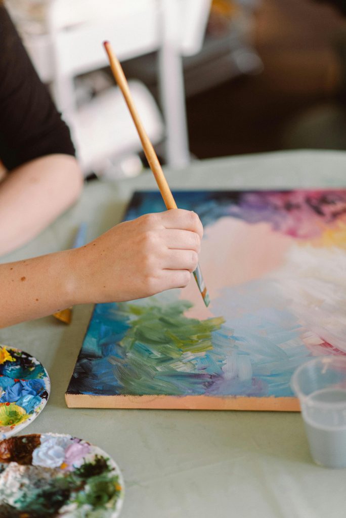
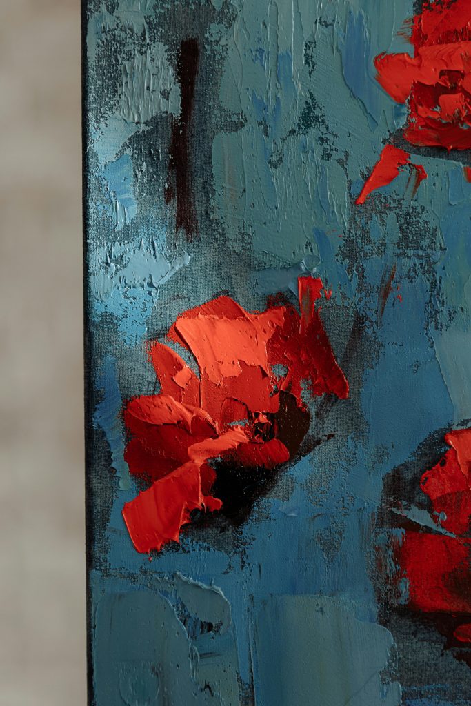
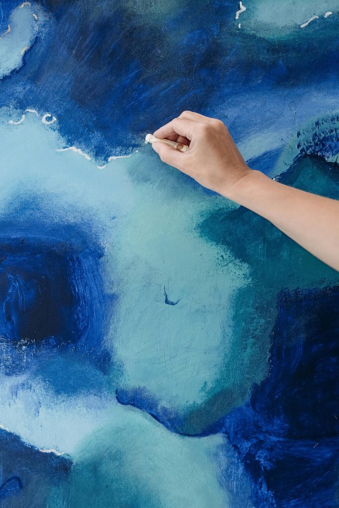
High-Quality Images Are Non-Negotiable
Even the most amazing artwork can fail to impress if your images don’t do it justice. Blurry, poorly lit, or color-inaccurate photos immediately lower the perceived quality of your work. Grant reviewers are visual people; they need to see your work clearly to understand your skills, style, and impact. Investing time in high-quality images is investing in your success.
Use consistent lighting and backgrounds. Neutral, uncluttered backgrounds allow your work to shine without distractions. Lighting should be even and bright enough to reveal texture, color, and detail, but not so harsh that it creates glare or shadows. Multiple angles may be needed for 3D work, installations, or projects with depth.
Maintain high resolution, but keep file sizes manageable. Reviewers will appreciate clear, sharp images that load quickly. Use common formats like JPEG or PDF that are universally accessible. Avoid heavy editing or filters; your work should be represented authentically.
For dimensional or multi-part pieces, include several views. This provides a fuller understanding of your work and demonstrates that you’ve thought about how reviewers experience it. It also signals professionalism and attention to detail.
Remember that each image is essentially a handshake, it introduces your work and communicates seriousness, skill, and clarity. Poor images make it easy for reviewers to dismiss even excellent concepts, so this step is non-negotiable.
Finally, review your images in context. Look at them as if you’ve never seen the work before. If something isn’t clear or doesn’t read well visually, adjust it. Your portfolio should be immediately understandable, engaging, and professional at first glance.
Context Is Key, Don’t Leave Them Guessing
Your artwork doesn’t exist in a vacuum. Reviewers need to understand why a piece matters, what it explores, and how it relates to your project goals. Providing context helps them connect with your work on an intellectual and emotional level. Without it, even strong work can feel flat or disconnected.
Use concise captions or descriptions for each piece. Explain the concept, medium, size, or inspiration. One to three sentences are usually enough; the goal is clarity, not overwhelming them with text. Think of it as guiding them gently through your portfolio.
Highlight anything relevant to the grant. If the funding focuses on innovation, point out your experimental methods. If the grant emphasizes social impact, show how your work engages communities. Context demonstrates alignment with the opportunity and shows that your work isn’t generic.
Avoid jargon-heavy language. Your goal is clear communication, not impressing them with art-school terminology. If a reviewer has to stop and decode your text, it breaks the flow of engagement and diminishes impact.
Descriptions can also subtly weave in your personal voice. Let your perspective and enthusiasm shine. Reviewers want to see a human being behind the work, not just images on a page.
Finally, context isn’t just helpful, it’s persuasive. When reviewers understand your thought process, your skills, and the purpose behind your work, they’re far more likely to see your project as worthy of support.
Include Your Artist Statement, It’s Your Voice
An artist statement gives reviewers direct insight into your vision, motivations, and practice. It complements your images, offering a narrative layer that makes your portfolio richer and more compelling. Think of it as your chance to speak to the reviewers without being in the room.
Keep your statement concise but meaningful. Focus on the central themes of your work, your inspirations, and what you aim to explore with your project. Avoid turning it into a long biography or a list of achievements; this is about vision and intent.
Tailor your statement to the grant. If the funder emphasizes cultural engagement, highlight the ways your work connects with audiences. If they focus on innovation, emphasize experimentation or research in your process. Contextual relevance makes your statement resonate.
Write in a warm, approachable, and professional voice. Your statement should feel like a conversation with the reviewer, not a stiff academic lecture. Personality matters; it helps reviewers feel a connection to your practice.
Avoid repeating every description from your images. Instead, synthesize key ideas and provide perspective. Your statement should enhance understanding, not replicate what’s already visible.
Finally, a strong artist statement signals professionalism, clarity, and self-awareness. Paired with a curated portfolio, it strengthens your case for funding by showing that your project is well thought out and ready to execute.
Tailor Everything to the Grant
Sending a generic portfolio is one of the fastest ways to be overlooked. Each grant has its own goals, values, and priorities. A portfolio that reflects your understanding of those priorities immediately positions you as a serious, strategic applicant.
Start by reviewing the grant guidelines carefully. Which kinds of projects do they fund? What themes, approaches, or impacts are emphasized? Identify pieces in your portfolio that best align with these focus areas. Tailoring shows respect for the reviewer’s time and priorities.
You may need to reorder or swap pieces. The most relevant works should appear first, while less relevant pieces can be later or omitted. This ensures that the first impression is aligned with the grant’s objectives, making it easy for reviewers to see the connection.
Adjust captions and your artist statement to emphasize alignment. Subtle reframing can make your portfolio feel custom-tailored without exaggerating or misrepresenting your work. Relevance and authenticity go hand in hand.
Even small tweaks, like highlighting a project’s social impact or experimental methods, can make a big difference. It signals thoughtfulness, professionalism, and intentionality in your application.
Ultimately, a tailored portfolio communicates clarity, focus, and readiness. Reviewers are more likely to fund applicants who clearly understand their own work and how it fits the goals of the opportunity. It’s not just about showing your art, it’s about showing why your art deserves support.
Navigating grant applications can feel overwhelming, especially when juggling deadlines, requirements, and crafting a standout portfolio. That’s why the Art Grants Mini Guide & Checklist is a lifesaver. It walks you step by step through identifying the right grants, preparing compelling applications, and staying organized so nothing slips through the cracks. With its easy-to-follow checklist, you can manage deadlines, keep track of required materials, and approach each application with confidence. For artists seeking to streamline the process and make it more strategic, this guide is the perfect companion. You can check it out here.
Captions That Don’t Boringly Explain, but Actually Speak
Captions are mini-conversations with your reviewer. Think of them as little windows into your process, rather than boring explanations. A dull caption like “Oil on canvas, 24×36” tells them nothing about why the piece matters. A good caption invites curiosity and gives context, guiding the reviewer through your work naturally.
Start by giving a hint of story or inspiration. Even one line about what motivated a piece can turn an image into an experience. Something like, “Exploring the tension between urban life and solitude, this series grew from late-night city walks,” immediately frames your work in a human context.
Use captions to highlight techniques or mediums in a way that feels casual, not instructional. You might say, “Layering acrylics over newspaper textures gave this piece a sense of fleeting memory,” which informs the reviewer without feeling like a technical manual.
Keep it brief but meaningful. One to three sentences is perfect; too much text can overwhelm or disrupt the flow. Captions should enhance the experience, not replace your portfolio’s visual impact.
Think about alignment with the grant’s goals. If a grant prioritizes community engagement, mention projects where collaboration or audience interaction shaped the outcome. These small cues make it easier for reviewers to see relevance.
Finally, let your personality peek through. A caption is also a chance to hint at your voice, humor, or unique perspective. Humanizing your portfolio makes it memorable and keeps the reviewer interested as they move through your work.
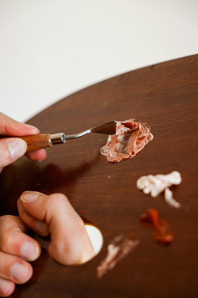
The Power of Showing Process, Not Just Finished Work
Many artists think only final pieces belong in a grant portfolio. That’s a mistake. Showing your creative process can communicate skill, thoughtfulness, and dedication in ways that finished work alone cannot. Reviewers love seeing how an idea evolves from concept to completion, it proves your work is intentional, not random.
Include sketches, maquettes, studies, or concept diagrams where relevant. These pieces reveal problem-solving skills and experimentation, both of which are highly valued by grant panels. It also gives a peek into how you approach challenges and refine ideas.
Explain process briefly in captions or your artist statement. A simple note like, “Experimented with layering papers to achieve texture and depth,” can contextualize a piece and show your methodical approach without cluttering the portfolio.
Process documentation can also tie your work to the grant’s priorities. If innovation is valued, showing experimentation demonstrates alignment. If social engagement is a goal, showing iterative work with community feedback can be persuasive.
Including process pieces breaks monotony visually as well. A portfolio of only final pieces can feel static; process elements add narrative variety and keep reviewers engaged.
Lastly, process works as a storytelling tool. It creates a sense of journey, showing how your ideas unfold. Reviewers connect with journeys, they’re invested in seeing how the final outcome emerged, which makes your project more compelling.
Tailor Your Portfolio Layout Like a Pro
The layout of your portfolio is more than aesthetics; it affects readability and perception. A well-designed layout guides the reviewer through your work effortlessly. Poor layout can make even incredible art feel chaotic or unpolished.
Think about flow and rhythm. Large, bold images should be balanced with smaller, detail-focused shots. Group similar works together to create visual coherence. Avoid clustering too many pieces on one page, it overwhelms the eye.
Use whitespace strategically. Breathing room around each image allows reviewers to focus and absorb details. It’s like giving your work a stage, it deserves to be seen clearly, without visual clutter stealing attention.
Digital portfolios also benefit from navigation cues. Clearly labeled sections or a table of contents can make scrolling or clicking intuitive. This shows professionalism and makes the reviewer’s job easier.
Consider the story you’re telling. The layout itself can communicate sequencing, priority, and relevance. Leading with the strongest piece, grouping works by theme, and ending with a memorable image all reinforce the narrative of your project.
Finally, remember that a clean, thoughtful layout demonstrates respect for your reviewer. It signals that you care not only about your work but about presenting it in a way that’s digestible, engaging, and memorable.
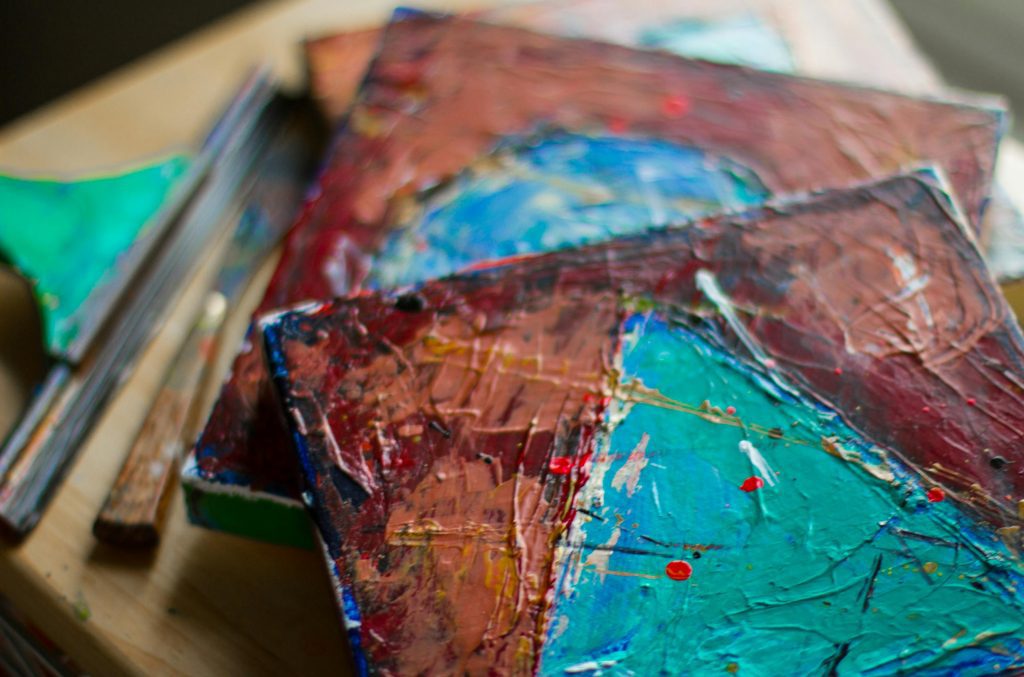
Include Only What Serves Your Project, Not Your Ego
It’s tempting to show everything you’ve ever made, especially pieces you personally love. But in a grant portfolio, every image must have a purpose. Extraneous works dilute the story you’re trying to tell and can confuse reviewers.
Ask yourself: does this piece directly support my proposed project or demonstrate a relevant skill? If the answer is no, it probably doesn’t belong. The goal is to prove capability, relevance, and alignment with the grant, not to showcase your entire creative history.
Focus on cohesion and narrative strength. Each work should lead naturally into the next, building a case for why funding this project makes sense. Random additions break flow and create cognitive friction for reviewers.
Be ruthless but intentional. It’s okay to leave out works that are technically strong but unrelated to the grant. You can always include them in other applications or your personal portfolio. Context matters more than everything.
Keep your ego in check, but let your vision shine. A strong portfolio doesn’t need filler, it’s compelling because it’s focused, coherent, and relevant. Less can truly be more.
Finally, remember that clarity over quantity is persuasive. Reviewers are more likely to engage with a concise, cohesive, and purpose-driven portfolio than a sprawling, unfocused collection.
Digital vs. Physical Portfolios, What Works Best?
Nowadays, most grant applications ask for digital portfolios, but some still allow physical submissions. Choosing the right format matters because it affects accessibility, impact, and clarity. Reviewers want convenience and clarity above all else.
Digital portfolios must be easy to navigate, properly formatted, and universally accessible. PDFs or portfolio websites are ideal, but make sure links work and files aren’t too large. You want reviewers to focus on your art, not technical frustrations.
Physical portfolios can shine for tactile, three-dimensional, or highly textured work. But if submitting in person or via mail, ensure images are crisp, consistent, and well-presented. Layout, spacing, and materials matter more than ever in physical formats.
Consider hybrid approaches. Even if a physical submission is allowed, providing a digital version ensures accessibility for remote reviewers or panel members. It also gives them flexibility to revisit your work after the first review.
Regardless of format, quality remains paramount. Blurry photos, inconsistent color, or poorly scanned images undermine your credibility and can overshadow excellent work. Always prioritize clarity and professionalism.
Finally, match the format to the grant’s instructions. Some funders explicitly request digital, others physical. Following these guidelines exactly demonstrates attention to detail, reliability, and respect for the reviewer’s time.
Keep It Human, Remember Reviewers Are People Too
It’s easy to get lost in technical perfection and forget that grant reviewers are people. They read dozens of applications in a day, and human connection matters. Portfolios that feel robotic or impersonal are quickly overlooked.
Let your voice and personality shine subtly through captions, descriptions, and your artist statement. Reviewers want to see the artist behind the work, not just objects on a page. Even small touches of humor, warmth, or insight make your portfolio more memorable.
Be approachable but professional. You want your portfolio to communicate competence and clarity, while also showing that you’re a thoughtful, engaged creator. Balance factual clarity with personal warmth.
Consider flow and pacing from the reviewer’s perspective. Too much text or overly complex layouts create friction. Think about readability, engagement, and a natural rhythm that keeps them scrolling or flipping pages with interest.
Remember, reviewers are humans who respond to story, authenticity, and clarity. A portfolio that balances technical quality with human insight is more likely to stick in their minds long after they’ve finished reviewing.
Finally, your portfolio is part of a conversation. It’s a way to connect, explain, and invite reviewers into your world. Done thoughtfully, it can turn a stack of applications into a memorable experience that makes funding your project feel obvious.