
Is Your Portfolio Mobile-Friendly? Here’s Why It Should Be
We’re All Browsing on Our Phones
Whether we’re curled up on the couch, waiting in line at the grocery store, or sneakily checking our phones in meetings, mobile browsing has taken over. Your future client, gallery owner, or fellow artist is probably discovering your work while scrolling between emails or during their commute. If your portfolio isn’t mobile-optimized, you’re missing the moment when curiosity turns into connection.
A sleek website that looks incredible on a desktop but falls apart on a phone is like a beautifully painted canvas crammed into a shoebox. The art gets lost. The experience gets muddled. And worst of all, the viewer might bounce before they even see your best piece. Attention spans are short, and first impressions are ruthless.
Think about how you browse. Do you zoom in? Squint? Click away when something doesn’t load? Exactly. Your portfolio should be built for that version of your audience: distracted, quick-tapping, and on the move. When it’s easy to explore your work on mobile, you’re already ahead of the curve.
This doesn’t mean ditching beauty for utility. It means designing with intention. Responsive layouts, fast-loading images, readable fonts, these things support your art. They don’t overshadow it. You can have a portfolio that’s both stunning and seamless.
Your website should feel like a gentle “welcome in,” not a puzzle to decode. Mobile-first design does just that, it respects your viewer’s time and showcases your work at its best.
Responsive Design Is Non-Negotiable
If your site doesn’t adapt to different screen sizes, it’s time to rebuild or tweak. Responsive design means your layout flexes to fit every screen, whether it’s a giant iPad Pro or a tiny iPhone . Without it, buttons overlap, images get cropped, and your navigation turns into a mess.
Luckily, most modern website builders (like Squarespace, Wix, and Webflow) come with responsive templates built in. But don’t just trust the template. Test it. Open your site on your phone, a tablet, and even a friend’s older device. See what works and what doesn’t.
Pay close attention to your image galleries. Are they swipeable? Do they load fast? Is the quality clear without taking forever? A blurry or laggy image on mobile can instantly dilute the impact of your strongest piece.
Your text matters, too. On mobile, small fonts or dense paragraphs are hard to read. Use clean typography, short sentences, and generous spacing. Think clarity over cleverness. Think conversation over clutter.
Responsive design is like a custom frame, it elevates without distracting. You’re not just showing your art. You’re showing how thoughtful and professional you are about the experience of your art.
Make Your Menu Simple (And Tappable)
If someone has to pinch-zoom just to find your contact page, they won’t bother. A clean, collapsible menu, also called a hamburger menu, makes your site easier to navigate on small screens. Keep it simple: “Home,” “Portfolio,” “About,” “Contact.” That’s often enough.
Avoid overloading your mobile nav with dropdowns, subcategories, or ten different portfolio folders. The goal is to guide the visitor effortlessly, not confuse them. If someone wants to learn more, they’ll scroll. But the first step needs to be friction-free.
Buttons should be large enough to tap with a thumb. Links should be spaced apart so they don’t overlap. And don’t forget accessibility: include alt text for images and contrast-friendly colors for readability.
Remember, mobile navigation isn’t just about design, it’s about emotion. Confusion creates anxiety. Ease creates trust. You want visitors to feel guided, not lost in a maze of tabs.
Think of it like a gallery walkthrough. You wouldn’t hang 50 pieces in one tiny room. You’d curate a path. Your mobile menu should do the same, give them space to move, pause, and admire.
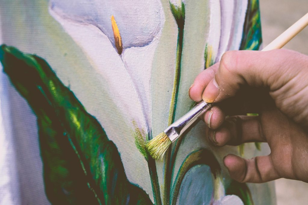
Choose Images That Shine on Small Screens
Mobile screens are small but mighty. Your visuals need to pop without overwhelming. That means choosing images that are crisp, well-lit, and high enough in resolution to look professional, but not so large they take forever to load.
Optimize your images before uploading. Tools like TinyPNG or Squoosh help compress without compromising clarity. A 5MB image file might look incredible on a 4K monitor, but it’ll choke on mobile. Aim for under 500KB when you can.
Use vertical or square images strategically. These fill phone screens more naturally and give your viewer a full-bodied look at your art. Horizontal works too, but on mobile, it often feels smaller or needs extra tapping to zoom.
And don’t upload everything you’ve ever made. Curate. Think “impact over inventory.” A few standout pieces that load beautifully and look balanced on mobile will always win over a clunky scroll-fest of 50 random works.
Give each image space to breathe. White space isn’t wasted space, it’s part of the presentation. Especially on mobile, where clutter can feel chaotic fast.
Mobile Isn’t Just Smaller, It’s Different
One of the biggest mistakes artists make? Thinking mobile is just a shrunken desktop. It’s not. It’s an entirely different experience, and it needs different thinking.
On a phone, people scroll vertically, quickly. They’re skimming while multitasking. That means your calls to action, artist statement, or exhibition list should be concise and placed higher up, don’t make them dig for it.
Your home page should be a highlight reel, not a table of contents. Lead with a compelling image or project. Add a short, heartfelt intro. Then invite them to explore more. On mobile, you’ve got about 3 seconds to make someone care. Make it count.
Consider mobile-specific features like tap-to-expand galleries, sticky contact buttons, or even a WhatsApp chat link. Tools like these make it easier for potential clients or curators to reach you instantly.
Use analytics tools like Hotjar or Google Analytics to track how mobile users interact with your site. If they’re bouncing quickly or not clicking through, it’s a sign something isn’t working.
Designing for mobile isn’t just resizing, it’s reimagining. The better you get at it, the more your site becomes a smooth, immersive experience people remember.
Test It Like a Visitor (Not the Artist)
It’s easy to get so wrapped up in your own website that you forget how it feels for someone new. So here’s your challenge: borrow a friend’s phone, open your site, and watch them use it. Don’t explain anything. Don’t point. Just watch.
Do they know where to tap? Are they pausing at your strongest pieces? Can they find your contact info easily? These real-time reactions are gold.
Also, test your site on multiple browsers, Safari, Chrome, Firefox. What looks perfect on one can glitch on another. Check both Android and iPhone if possible. Aim for consistency across the board.
Try accessing it with low signal. Does it still load? Or does it crumble? Mobile users aren’t always on Wi-Fi. Your site should be light enough to function even on 3G.
And once you’ve watched others explore your site, take notes. What confused them? What delighted them? Then tweak accordingly. The goal isn’t perfection. It’s clarity and confidence.
Your art deserves to be experienced without obstacles. Testing helps you get there.
Add a Sticky Contact or Inquiry Button
If someone loves your work, don’t make them dig for how to reach you. A sticky contact button, one that stays visible as they scroll, makes it easy for viewers to connect in real time.
You can link this to a contact form, email address, or even a short inquiry form (“Interested in a commission? Let’s talk!”). Platforms like Wix, Webflow, or Carrd make this easy with plugins and widgets.
Bonus tip? Keep your form short. On mobile, no one wants to fill out ten fields. Name, email, and message are often enough. You can ask for details later.
Consider adding a “Let’s Connect” button at the bottom of every section. Repetition makes it easier to act without feeling pushy.
Accessibility again matters here, make sure the button color contrasts with the background and the text is large enough to tap easily.
You want viewers to fall in love with your work, then have zero friction in reaching out. Sticky buttons quietly remove that friction.

Quick Fixes for a Better Mobile Portfolio
Feeling overwhelmed? You don’t need to rebuild everything overnight. Start with a few quick wins that instantly improve the mobile experience:
- Compress and re-upload your images for faster loading
- Swap out small fonts for readable mobile-friendly ones
- Simplify your menu to 3–5 items
- Reorder sections so your strongest work comes first
- Add white space between elements to reduce clutter
If you’re using a platform like Squarespace or Wix, preview your site in mobile view and make tweaks directly. It’s easier than you think.
For artists using Instagram as a primary platform, consider using a mobile-optimized link-in-bio tool (like Linktree or Later’s Linkin.bio) to drive traffic to your actual portfolio. These tools act like a simplified homepage.
Don’t get stuck in perfection mode. Mobile optimization is a process. Do a little every week. Small changes, big difference.
Want a Mobile-Friendly Portfolio Without the Tech Stress? Build It on Women in Arts Network
building a mobile-optimized artist portfolio from scratch can feel like a whole separate art form. Between resizing images, figuring out layout templates, and making sure it doesn’t break on a phone screen, it’s enough to make you want to run back to your sketchbook. But here’s a much easier option: use a platform that already does the heavy lifting for you. Enter Women in Arts Network, a free space built specifically for women creatives to showcase their work, and yes, it’s designed to look great on any device. No coding, no stress, and it takes less time than brewing your morning coffee.
Here’s how to build your portfolio there (in minutes, not months):
- Go to womeninartsnetwork.com
Start by heading to the site where thousands of women artists are already building visibility. Look for the “Join Now” or “Create Profile” button on the homepage. - Create Your Free Account
Sign up with your name, email, and a password. You’ll get a confirmation email to verify your account. Quick tip: check your spam folder just in case it sneaks in there. - Select the “Artist” Role
When prompted, choose “Artist” so the platform knows you want access to the creative profile features built for visual makers. - Build Your Portfolio Page
Add your headshot, artist bio, and upload images of your work. There’s space for media, styles, your website or shop links, and contact info. Everything displays beautifully on mobile, no need to format anything manually. - Show Up in Their Artist Directory
Once you’re set up, your profile becomes part of their searchable global database. Curators, brands, and other creatives browsing the network can now find you, and see your art in its best light. - Keep It Fresh
You can update your profile anytime. Add new work, change your links, or tweak your artist statement. The more current it stays, the more visible and relevant you remain.
Make It Easy for Them to Fall in Love
Your mobile portfolio isn’t just a scaled-down version of your website. It’s a portable invitation to experience your art. When someone taps your link, they’re opening a door. Make sure what they find inside is clear, warm, and thoughtfully curated.
You don’t need to overcomplicate it. You just need to respect the viewer’s time and trust that your work will speak volumes when given the right frame. Mobile optimization is part of that frame.
Because here’s the truth: people do judge a portfolio by its cover. And if your cover works on any screen, you’re already making an unforgettable first impression.
So go ahead, scroll your own site, tighten it up, and let your art shine wherever it’s seen