
She’s Obsessive About Getting It Right & It Doesn’t Always Feel Great I Nanami Cowdroy
At Women in Arts Network, we’ve learned something about exhibitions that nobody tells you upfront: the work that haunts you isn’t always the work that impresses you first. Sometimes it’s the piece that makes you uncomfortable, that forces you to stop and reckon with something you didn’t know you were avoiding.
This time, we chose Birds as our theme. We expected wings, freedom, maybe some delicate rendering of feathers catching light. What we weren’t prepared for was an artist who would take that simple prompt and turn it into something that felt less like nature observation and more like staring into obsession itself.
Nanami Cowdroy’s work arrived in our submissions, and we couldn’t look away. Not because it was pretty though it is, in a way that makes you slightly uneasy. But because every line, every intricate detail, every deliberate choice to work only in black and white felt like it was daring us to understand why someone would spend weeks, maybe months, rendering something with that level of intensity.
We selected Nanami not because her work fit the theme neatly, but because it challenged everything we thought we knew about how artists approach a subject. There’s something almost defiant in her process, something that suggests the work isn’t just about birds at all it’s about what happens when you can’t stop until something matches the picture in your head, even when getting there exhausts you.
Before we hear from Nanami directly, here’s what you need to know about an artist who learned early that you don’t have to choose between worlds you can just let them crash into each other and see what survives.
Nanami was born in Sydney. Japanese mother, Australian father. Most bicultural stories involve struggle, displacement, the pain of not quite belonging. Hers doesn’t. She just moved between Tokyo and Sydney so regularly that it stopped feeling like switching it just became her baseline. Her mum teaches traditional ikebana. Her family on both sides ended up scattered across creative fields photography, cartooning, design. The house she grew up in was a collision: Japanese ink paintings next to Australian bush landscapes, ceramics with cherry blossoms beside clay pots, everything coexisting without anyone feeling the need to curate it into coherence.
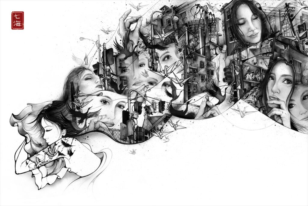
She also grew up in Potts Point during the 80s and 90s when it wasn’t gentrified yet, when it was still rough and complicated and real. That urban mess the broken sitting next to the beautiful became part of how she sees. Nothing needs to be cleaned up to matter.
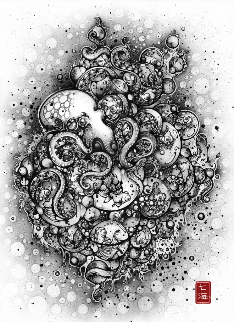
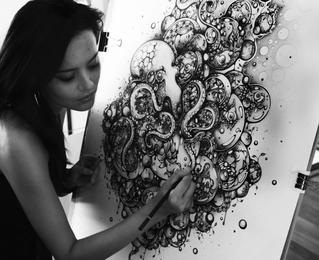
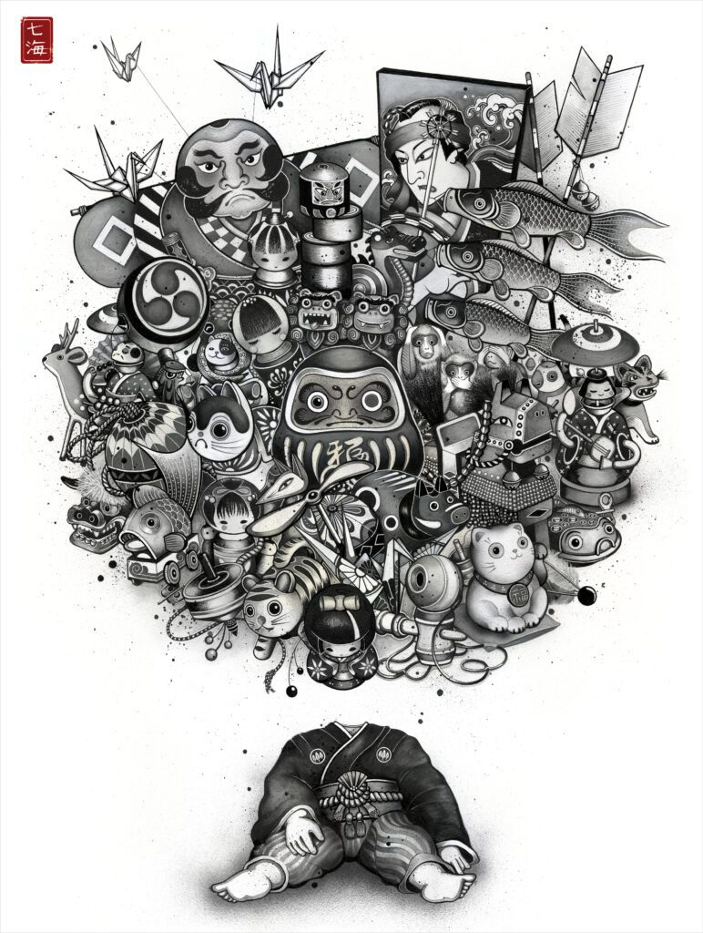
She works almost exclusively in black and white, and it’s worth asking why. Most artists choose a palette because it looks good. Nanami chose it because color overwhelms her. She’s direct about that. Too many meanings, too many emotional directions, too much noise. Black and white gives her something to push against without drowning.
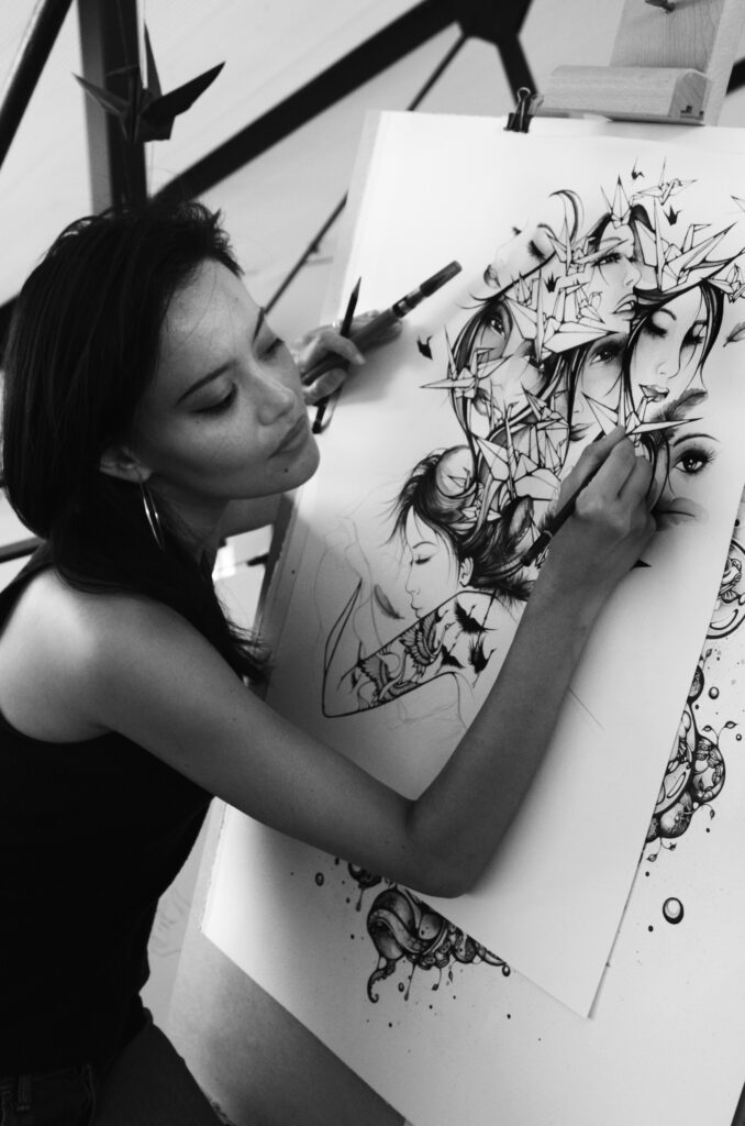
Her process is what most formal training would call reckless: she doesn’t plan, doesn’t sketch extensively beforehand. She’s learned that when she tries to prepare too much, she loses whatever spark made her want to create the piece in the first place. So she just starts pen on paper, mental image in her head and follows where it goes. Sometimes it works. Sometimes it doesn’t, and she throws it out and begins again.
That willingness to waste time, to start over, to keep chasing something that might never fully match what’s in her head that’s not romantic. That’s just what happens when you can’t stop until it feels right, even when “right” is something only you can define.
She calls herself obsessive about it. And she’s honest enough to admit it doesn’t always feel good. But she keeps doing it anyway.
Now, let’s hear from Nanami herself about what it means to work in a medium that won’t let you hide, about starting without a plan and trusting you’ll figure it out, and why being obsessive about getting it right doesn’t make the process feel better it just makes stopping impossible.
Q1. Can you share your background and how growing up between Japanese and European cultures shaped the way you see the world and make art?
I was born in Sydney. My mum is Japanese and my dad was Australian, and I’m very close to my Japanese family. We went back to Tokyo almost every year when I was growing up, so moving between those two cultures never felt weird. It just was. My mum is a traditional Japanese ikebana teacher. On her side of the family, my aunt is a kimono dresser, and my uncle is a photographer and documentary filmmaker in Japan. On my dad’s side, the Cowdroys ended up in art, design and writing. One uncle was a political cartoonist for ‘The Age’ newspaper in Melbourne. Our house was full of artwork and books. Dad was into Time Life books, so there were art and history books everywhere. We had Japanese sumi-e ink paintings and landscape scrolls showing mountains, bamboo forests, shrines and bridges, and framed ukiyo-e woodblock prints. Those hung next to oil paintings of the Australian bush and watercolours of harbours, yachts and farmland. It was just life, not something I’d think to question. Mum collected vases for her ikebana, so Japanese ceramics with cherry blossoms sat alongside Australian clay pots with gum-nut patterns, which honestly weren’t as tacky as they sound. That mix of things was my visual world. I didn’t analyse it then, I just absorbed it. Outside the home, I grew up in Potts Point in the 80s and 90s, when it was rougher and seedier than it is now. That inner-city chaos was part of my life too, and I think it feeds into how I see things visually — the beautiful sitting right next to the messy, and both of them matter.
Q2. Your work is known for its intricate pen and ink detail, fluid line-work, and monochrome palette. How do you think about the emotional or narrative power of working primarily in black and white?
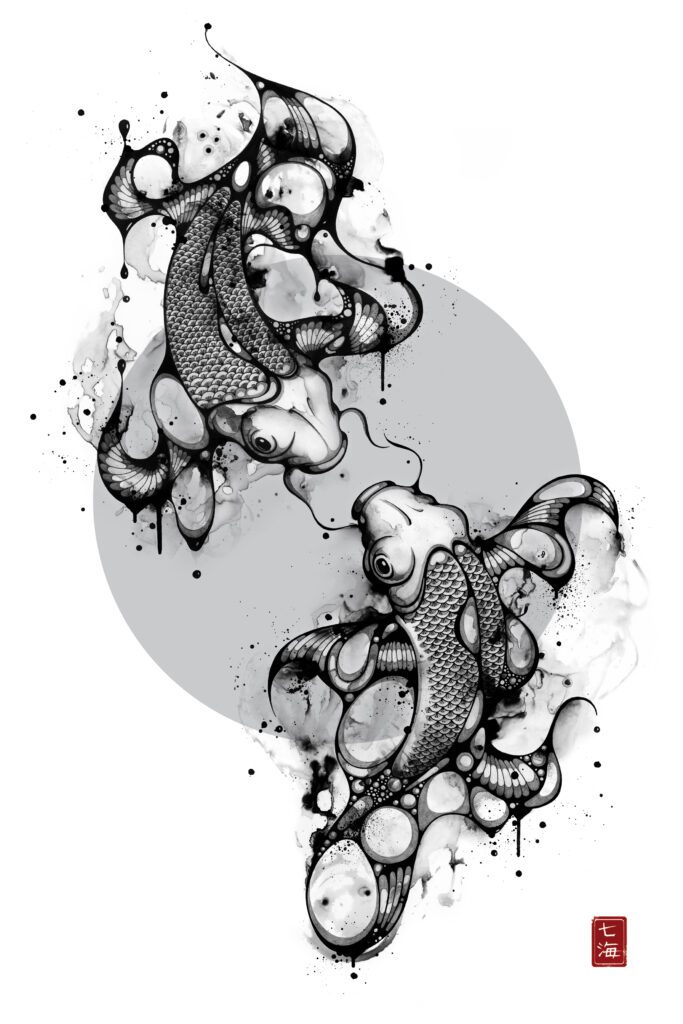
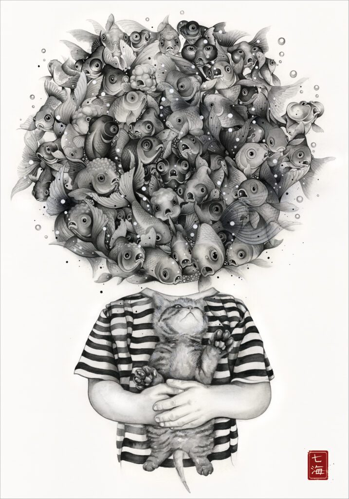
I’ve always been drawn to black and white, not just in my artwork, but in how I dress and in the way I set up my studio and my home. Colour has loads of power. There are so many meanings attached to it, so many moods and choices, and honestly, that can shut me down. Black and white gives me a structure I can push against and enjoy working with. It simplifies things so I can focus online, light and shade without everything pulling in a million directions. Black and white also feels honest. There’s no hiding, nothing to soften nerves with colour. What’s there has to work. I think that quality helps with subjects in nature that might be fragile, like goldfish or sea creatures, and gives them a sturdiness that makes them feel lasting rather than delicate.
Q3. You’ve described your process as beginning with a distinct mental picture and then letting the piece evolve organically. How does intuition guide your hand once the first lines are down?
When I’m making my own work, not design work, I rarely plan or sketch ahead. Over time, I’ve realised that the first go at something is usually the strongest. When I try to do lots of preliminaries, I often lose the spark by the time I work on the final piece. I usually start with a subject I feel drawn to and can see in my head. From there, I just go with it and let the drawing unfold. I respond to what’s happening on the paper rather than following a fixed plan. That makes the process meditative and visceral. Sometimes sections get too heavy or too loose, and if I can’t find a balance, I’ll begin again. It’s not efficient, but it feels honest, and it’s how the work really becomes itself.
Q4. Many of your pieces emerge without extensive preliminary sketches you “jump in the deep end.” What do you learn about a piece from working this way that you might not learn from careful planning?
Putting pencil to paper without over-planning keeps my brain quiet and lets intuition take the lead. I start with a mental picture of what I want, but it rarely ends up looking exactly like that initial idea. I think it’s interesting to see how a thought evolves into something physical and unexpected. Because I love working with lots of detail, I like to keep my energy for the final piece rather than spreading it across multiple versions. Working straight on the final work makes the process feel more fluid, more connected to how I’m feeling in that moment.
Q5. Urban chaos and organic elements coexist in your visual world from tangled power lines to graceful floating creatures. How do you think about the relationship between order and chaos in your compositions?
I’m really drawn to the balance between those two things. My mum’s ikebana teaching taught me about harmony, balance and working with nature. There’s a simplicity to that philosophy that I respect, but I don’t limit myself to simplicity. I love detail and the energy that comes from complex forms. So in my work, the busy, intricate parts are deliberate. I want them to feel intense and alive. But I also make sure there’s space for the eye to rest. That calm part is just as important as the chaos. When those elements sit together well, the image feels complete and whole.
Q6. Your work draws both on tradition and contemporary pop culture collaborations. How do you balance cultural specificity with universal appeal in your art?
I actually love collaboration. I enjoy responding to a brief and thinking about how my style can work within someone else’s parameters. Having worked in design and advertising, that challenge feels natural to me. Some people think commercial projects are “selling out”, but I see them as opportunities for people to buy into my way of looking at the world. That’s exciting, not compromising. A lot of the objects I draw come from memories — things my mum brought back from Japan like Daruma dolls, Kokeshi dolls, bamboo dragonflies, spinning tops and origami cranes. They’re simple, handmade objects that carry calm, focus and nostalgia, and I think those feelings translate even when someone doesn’t know their cultural origin.
Q7. Some of your works evolve over weeks or months. How do patience and sustained attention to detail affect the emotional depth of your compositions?
I can be obsessive, and that doesn’t always feel great. If something isn’t coming out the way I see it in my head, I’ll keep trying again and again until it feels close. That can be energising but also frustrating and exhausting. The mood of a piece can also shift over time. Something that starts off light can end up much darker, depending on how I’m feeling while I’m working on it. Because I don’t plan rigidly, the final image often surprises me, and that’s part of what gives the work its emotional complexity.
Q8. Do you ever find yourself surprised by the ways people interpret your motifs whether fish, cranes, or urban imagery and how do you reflect on that in future work?
I really appreciate it when people connect with the work in personal ways. Some have even asked to use my drawings as tattoos, and that’s humbling. People see things in the work I wasn’t fully conscious of, and I don’t try to correct that. Interpretation is part of the life of the piece once it’s out there, and sometimes those responses feed back into what I make next.
Q9. Your work has been featured in collaborations with major brands and exhibited internationally. How do you think about the role of your art in public or commercial spaces as compared to fine art contexts?
For me, it’s all art. Whether it’s on a wall in a gallery, a mural in a public space, or part of a collaboration, it still comes from the same way of seeing and making. What changes is how people encounter it. I like that work can meet someone unexpectedly in their everyday world, not just in a gallery.
Q10. Your father’s encouragement helped you return to drawing as a way to cope and heal. Looking back, what advice would you give to artists who are learning to trust their instincts and emotional voice in their work?
Find what feels authentic to you. Choosing a creative path isn’t easy or secure, so you have to be passionate about it. For me, it took losing my dad to come back to drawing in a way that felt natural again. Art became a way to process grief and be present with it. There aren’t rules, but self-discipline matters. I studied design at university and worked in advertising for many years before coming back to what I love the most ie. illustration, and that experience shaped me too. Going back to what always felt right — drawing, painting, creating and making — was like coming home.
Talking with Nanami, I keep circling back to something most people misunderstand about obsession: we romanticize it. We think it’s passion, dedication, the mark of a true artist. But Nanami was honest enough to say what most won’t: “I can be obsessive, and that doesn’t always feel great.”
That admission breaks the myth. Obsession isn’t always fulfilling. Sometimes it’s just the inability to stop even when continuing is exhausting, frustrating, maddening. You keep going not because it feels good but because stopping before it’s right would feel worse. That’s not poetry. That’s just what it costs to make work that actually matters to you.
What strikes me about her practice is how she’s managed to live inside contradictions without trying to resolve them. She grew up between Japanese and Australian cultures, and instead of narrativizing that into some struggle about identity or belonging, she just let both exist. The chaos of inner-city Sydney in the 90s sitting next to the discipline and harmony of ikebana. Urban mess coexisting with organic grace. She didn’t choose a side. She didn’t try to synthesize them into something new. She just let them crash into each other and worked with whatever survived.
Her choice to work only in black and white feels less like aesthetic preference and more like self-preservation. She’s clear about why: color shuts her down. Too many associations, too many emotional directions pulling at once. In a culture that equates abundance with value, her refusal to add what overwhelms her feels quietly radical. She’s not interested in giving you more. She’s interested in giving you clarity.
There’s something I appreciate in how she refuses to separate commercial work from “real” art. She’s worked in design and advertising for years, and she doesn’t apologize for it or treat collaboration as compromise. For her, it’s all the same way of seeing—just meeting people in different contexts. Some artists guard their work like it loses value if too many people access it. Nanami understands that accessibility doesn’t diminish anything. If the work is honest, it doesn’t matter where people encounter it.
What Nanami’s practice taught me: balance isn’t about eliminating tension. It’s about letting opposing forces coexist without trying to reconcile them. Order and chaos. Tradition and contemporary culture. The discipline of black and white and the wildness of starting without a plan. And sometimes the most honest thing you can admit isn’t that you love what you do it’s that you can’t stop doing it even when it doesn’t feel great, because stopping would mean losing the only way you know how to make sense of what you’re carrying.
Follow Nanami from the links below to see work that refuses to perform ease where obsessive detail meets organic unpredictability, where two cultures coexist without explanation, and where black and white become the only language honest enough for everything she can’t say any other way.