
Portfolio Organization Tips Every Artist Should Know
Think about the last time you walked into a cluttered room. Even if there were treasures hidden in there, it felt overwhelming and hard to appreciate anything. The same thing happens when someone lands on an artist’s online portfolio. If the layout is messy or overloaded, the work gets lost in the noise. A clean design lets the art breathe, giving viewers the space to engage without distraction.
For many artists, the instinct is to show everything, as if quantity proves dedication. But the truth is, curation is what makes your portfolio powerful. A neat, intentional structure signals professionalism and makes your work look more valuable. A juror, curator, or collector will always feel more confident about an artist who can present their creations with clarity.
Imagine two portfolios side by side. One is crowded with different images, overlapping menus, and text that competes for attention. The other has white space, clear navigation, and each artwork given its own spotlight. Even if the art is equally strong, the second will leave a more lasting impression simply because the viewer could focus. Layout isn’t decoration, it’s part of how your art communicates.
When you invest time into simplifying your portfolio’s layout, you’re doing more than just making it pretty. You’re shaping how people experience your work. Clean design is not about being minimal for the sake of style, it’s about making sure nothing gets in the way of your art speaking for itself.
The First Impression Test
Most curators, jurors, or buyers make up their mind within seconds of opening a portfolio. This might feel unfair, but it’s human nature. When someone lands on your page, they want immediate clarity. A cluttered homepage or confusing navigation can make them click away before they even see your best piece. Passing the “first impression test” is essential for keeping them engaged long enough to connect with your art.
A good test is to ask a friend to open your portfolio for the first time and watch what they do. Do they pause because they don’t know where to click? Do they scroll past important pieces because they’re buried in text? Their reaction will mirror what jurors or buyers experience. You may think everything is obvious, but an outsider’s perspective often shows where the confusion lies.
First impressions aren’t just about navigation. The visual tone you set also matters. A homepage cluttered with mismatched fonts and uneven thumbnails tells the viewer that presentation wasn’t a priority. But a consistent design, with aligned images and clear typography, feels intentional. It says, “This artist takes their work seriously.”
Remember, the goal is not to impress with bells and whistles but to invite someone into your creative world. If the first page is simple, balanced, and visually calm, they’ll want to keep exploring. And once they linger, your art has more time to do the real talking.
Let Your Art Lead the Way
A common mistake artists make when building online portfolios is letting the layout overshadow the artwork. Flashy backgrounds, busy templates, or too many extra design elements can make viewers focus more on the website than the actual pieces. Your art should always be the star, and the layout should quietly guide people toward it.
One practical way to achieve this is by choosing neutral colors for the background. A soft white, black, or grey frame allows colors and textures in your work to pop. Think of it like gallery walls , curators rarely paint them neon because they don’t want the wall to compete with the artwork. The same principle applies online.
Consistency also matters here. Use the same image size and spacing for your works so the portfolio feels harmonious. If one piece is huge and another tiny, the visual imbalance distracts from the art itself. When everything is presented evenly, the eye naturally moves from piece to piece without interruption, like walking through a well-organized exhibition.
Artists sometimes fear that a simple layout will feel boring, but the opposite is usually true. Clean design highlights the details of your brushstrokes, colors, and concepts. When someone can focus fully on the work without distraction, they connect more deeply with your creative voice. Your art has its own energy , the layout just needs to clear the stage for it to shine.
The Power of White Space
Many artists feel the urge to fill every inch of their portfolio page, almost as if leaving space means leaving it unfinished. But here’s the thing: white space is not empty space, it’s active space. It frames your artwork and gives the viewer’s eye a moment to rest. Just like in a gallery, where works are hung with breathing room between them, online portfolios benefit from balance and spaciousness.
White space helps to create rhythm in how someone views your work. If every image is crammed next to another, the eye doesn’t know where to land. But with intentional spacing, each piece stands on its own. Think of it as the pause between musical notes , it makes the melody stronger. Your art deserves that same clarity.
A cluttered layout can make even strong work feel less professional, while a portfolio that uses spacing wisely instantly feels polished. It communicates confidence because you’re not trying to shout over the noise, you’re letting the art do the talking. It’s a small design choice with a huge impact.
The next time you update your portfolio, try removing one element from the page instead of adding more. Often, less really is more. White space doesn’t take away from your art , it honors it.
Organising by Series or Theme
Another key way to enhance your online portfolio is to group your works by series, medium, or theme rather than presenting everything in one endless scroll. Viewers appreciate context, and organization helps them understand your artistic journey. Instead of random paintings or digital pieces scattered throughout, a curated structure makes your portfolio feel cohesive and intentional.
For example, if you’re a painter who explores both landscapes and abstract forms, separating these into their own sections allows each body of work to shine. A juror looking for strong conceptual development will immediately notice that you think in series, not in one-off experiments. This is the kind of detail that signals maturity as an artist.
Organising also makes navigation easier for different audiences. A curator might want to explore your conceptual works, while a buyer could be drawn to your more decorative pieces. Clear sections allow each type of visitor to find what resonates with them without confusion.
Think of your portfolio like a guided tour. Instead of dropping someone into a warehouse full of art, you’re leading them through rooms where everything connects. That sense of structure not only makes your portfolio easier to view, but also tells a story about your artistic process.
Keep Navigation Simple and Intuitive for Viewers
If someone has to click five times just to find your paintings, they probably won’t stick around. Simple, intuitive navigation is one of the most overlooked aspects of an online portfolio, yet it’s often the deciding factor in whether someone fully explores your work. The goal is to make every step obvious without overthinking.
A clear top menu with straightforward labels like “Paintings,” “Photography,” “About,” and “Contact” works better than clever but confusing names. Visitors don’t want to solve a puzzle, they just want to see your art. The faster they can get to it, the more likely they’ll stay engaged.
Consistency is also crucial. If the menu disappears halfway through or links lead to dead pages, the portfolio feels unprofessional. Test your site regularly, not just when you launch it. Broken navigation is one of the quickest ways to lose trust.
Think of navigation like the lighting in a gallery. If it’s well done, people don’t notice it , they notice the art. But if it’s bad, it ruins the experience. When your portfolio’s navigation is simple and seamless, viewers barely think about it, they just enjoy your work. And that’s exactly what you want.
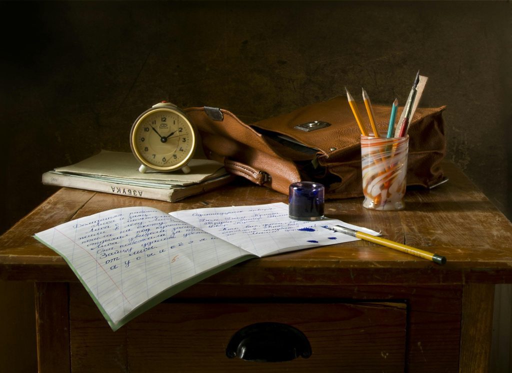
Use High-Quality Images ONLY
The first impression of your art online is always through its photographs. No matter how brilliant the work itself may be, if the image is blurry, poorly lit, or taken at an odd angle, the impact is lost. High-quality images are non-negotiable when it comes to showcasing your portfolio.
Imagine a curator clicking through your portfolio and pausing at a dark, grainy photo of your painting. Instead of seeing brushwork, they’re distracted by the shadow of your phone in the corner. It’s not your art they’re judging anymore, it’s the presentation. A great piece can look unprofessional in seconds if the image doesn’t match its quality.
Investing time in photographing your work under natural light or with a softbox makes all the difference. A tripod can also eliminate the tiny shakes that ruin sharpness. These details may feel tedious, but they communicate professionalism before you even say a word.
Remember, your portfolio should feel as close to an in-person viewing as possible. High-resolution images allow viewers to zoom in, notice textures, and connect with the details. It’s the next best thing to standing in front of your piece at a gallery wall.
Avoiding Clutter and Distractions specifically
An online portfolio should be a stage where your artwork is the star, not a noisy space filled with competing elements. Yet many artists overload their pages with flashing banners, unnecessary widgets, or bold backgrounds that overshadow the work. The result? Instead of focusing on your art, the visitor is caught up in the visual noise.
Think about it this way: would you hang a neon sign next to your painting in a gallery? Probably not. Then why add distracting elements online? Every design choice in your portfolio should serve one purpose, to highlight your art. Clean, minimal layouts don’t mean boring, they mean professional.
Even typography plays a role. Fancy fonts might look artistic, but if they’re hard to read, they become obstacles. A clear, neutral font keeps the spotlight on your work while still giving the page personality.
A useful test is to step back and ask yourself, “Do I notice my artwork first or the layout first?” If it’s the layout, you need to simplify. Your portfolio should be the calm, uncluttered room where your art speaks loudly and clearly.
Include a Thoughtful About Page for connection
Your art speaks volumes, but people also want to know the person behind it. A thoughtful “About” page is one of the most visited sections of any artist portfolio. It’s where curators, jurors, and buyers look to understand your perspective and your journey. Skipping it, or writing something too vague, leaves a gap in your presentation.
An effective “About” page doesn’t have to be long or overly formal. Think of it as an introduction at an exhibition opening. Share who you are, your practice, and what themes drive your work. It should feel like you’re letting the reader in, not just reciting a résumé.
Adding a professional photo of yourself in your studio can also help. It makes the experience more personal, showing the human side behind the art. This builds trust and helps people feel more connected to your practice.
The key is balance. Don’t overwhelm readers with every detail of your career timeline, but don’t keep it so brief that they walk away with no sense of your voice. A clear, authentic introduction goes a long way in making your portfolio memorable.
Make Navigation Smooth, Simple and Easy to Understand
Even the most beautiful portfolio can lose its impact if it’s hard to navigate. If visitors have to click endlessly, guess where to find things, or scroll through confusing menus, they’ll likely give up before seeing your best work. Navigation is like the map of your portfolio, and it should be so clear that anyone can find what they’re looking for in seconds.
Keep your menu straightforward with just a few essential categories: portfolio, about, contact, and maybe a blog or shop if relevant. Anything more can feel overwhelming. Drop-down menus with too many layers are usually a red flag, as they signal complexity when simplicity is key.
It also helps to consider the mobile experience. A curator may be browsing your portfolio on their phone while commuting, so your layout should adapt smoothly to small screens. If they have to pinch, zoom, or wait for heavy files to load, they won’t stay long.
Good navigation feels invisible. The less a visitor has to think about where to click, the more mental space they have to focus on your artwork. That’s the goal, a seamless flow that makes your art the central focus without distraction.
Tips and Tricks to Elevate Your Portfolio
- Limit each page to 8–12 pieces of work. More than that can be overwhelming. Rotate regularly to keep it fresh.
- Add subtle branding. A consistent color palette, logo, or header font can make your portfolio feel cohesive without stealing attention.
- Use alt text for accessibility. Not only does it help with SEO, but it ensures visually impaired audiences can still engage with your work.
- Include easy contact options. A simple “Email Me” button or form at the bottom of each page avoids frustration.
- Check load times. Compress images without losing quality so your pages don’t take forever to open.
- Update quarterly. Treat your portfolio like a living document, always reflecting your latest and best work.
These small details can make the difference between a portfolio that feels amateur and one that feels polished, professional, and ready to impress curators, buyers, and collaborators.