
5 Moments Mark Rothko Changed How We View Colour
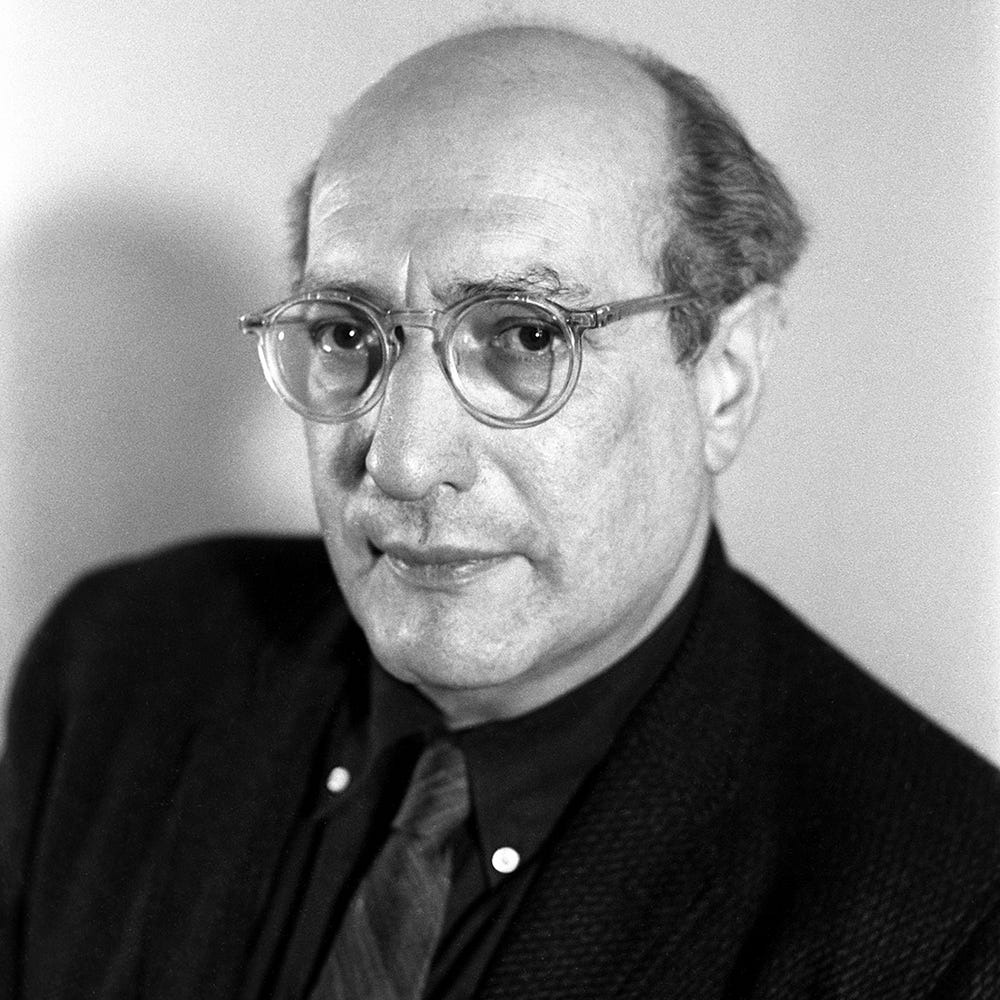
If you’ve ever walked into a room and felt like the walls themselves were alive, you’ve experienced a little bit of what Rothko aimed for. Born in 1903 in Dvinsk (now Daugavpils, Latvia), Rothko emigrated to the United States as a child and later became one of the seminal figures of the Abstract Expressionist movement.
What made his work stand out was his belief that colour alone, large fields of it, softly edged and hovering on the canvas, could evoke deep human emotion: tragedy, ecstasy, even the sense of the sublime.
Rather than depicting people, stories or objects, he pared things back to basics: light, colour, scale, and how the viewer feels in relation to the painting. That minimal‑but‑profound approach earned him critical acclaim in his lifetime and cemented his legacy afterwards.
Today, Rothko’s art continues to resonate, not because it copied past trends, but because it stripped away the noise and asked the viewer simply to feel. His paintings feel timeless because they don’t rely on style, fashion, or narrative, they rely on presence.
In this article, we’ll explore how Rothko’s practice still matters, his methods, his thinking and his fearless reduction of form, and how as an artist you can borrow from his example to engage your audience in new, deeply human ways.
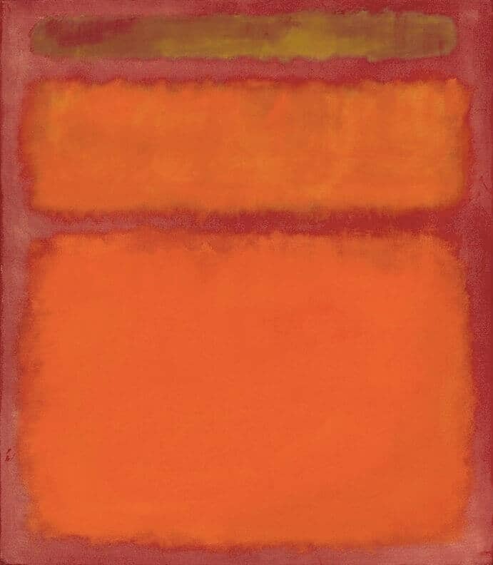
Orange and Yellow (1956)
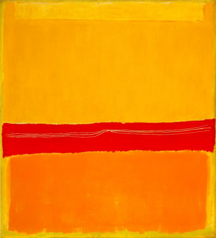
Walking into Orange and Yellow feels like stepping into a glow, those broad blocks of yellow above orange hover gently, quietly commanding your gaze. Rothko’s brilliance here lies in how the colours don’t just sit, they vibrate, softly shifting under your eyes. He achieved this effect through thin washes of pigment, letting colour bleed into the canvas and build subtle luminosity.
Critics praise this work as a turning point, the abstraction matured, the emotion distilled. It’s not showing a scene or a figure, it’s showing presence, a moment of being. That shift made Rothko acclaimed as someone who didn’t just paint colours, but sculpted feeling with them.
In your own work, you might try thinking of colour as space, as mood, as architecture. What if your landscape or abstract piece asked not “what is this?” but “how do I feel this?” Rothko invites that question, and the silence around it.
Notice how the edges blur, those rectangles aren’t rigid blocks but breath at the edges. That softness allows the viewer’s eye to float between areas, finding stillness in motion. Try something similar: soften your transitions, give your elements room.
Finally, the scale matters. This large canvas invites you in. Even if your work is smaller, ask: how can I make the viewer inhabit the piece rather than simply view it? That’s what lets colour field painting carry weight, and lets your own pieces carry presence.
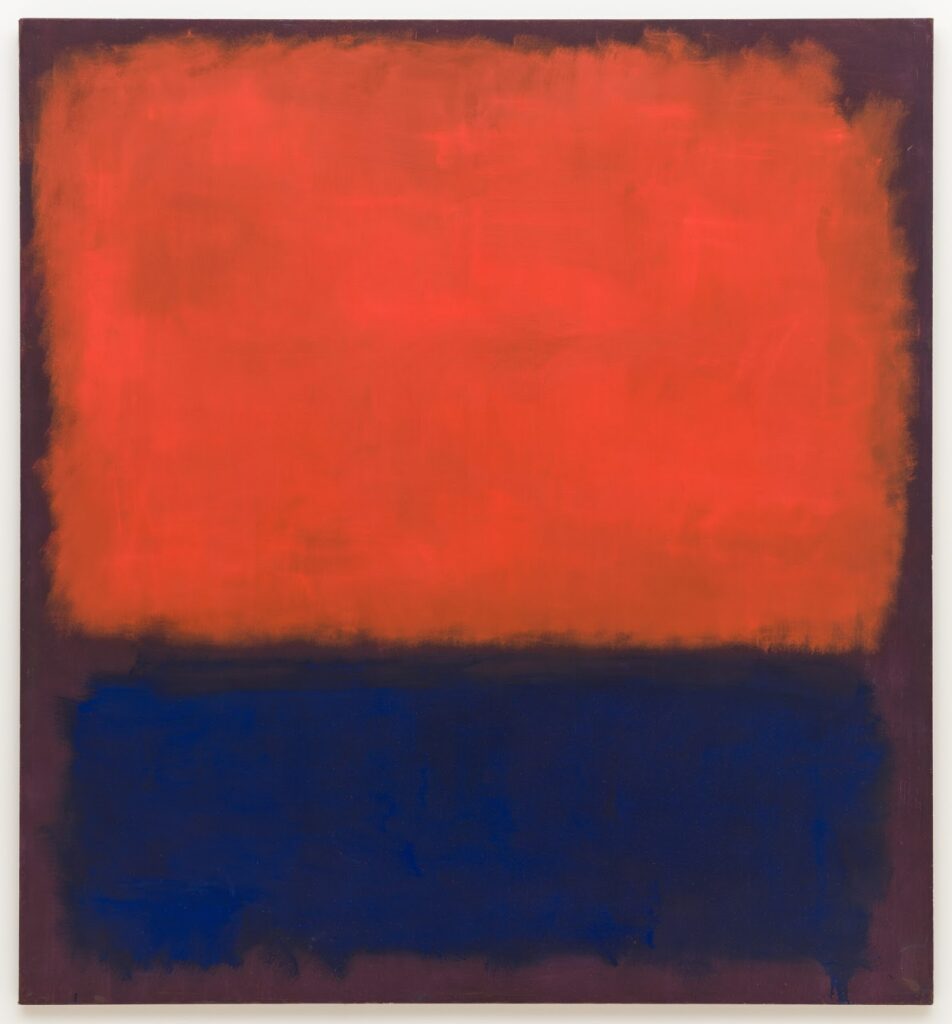
No. 61 (Rust and Blue) (1953)
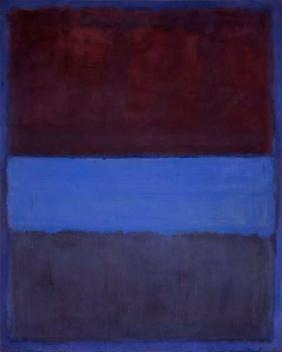
In No.61 (Rust and Blue), Rothko dives into mood. The rich rust tones above, the deep blue below, they don’t just coexist, they converse. The distance between colours, the layering, the scale: all of it heightens emotion without telling a story.
He was acclaimed for making paintings where you felt things as much as you saw them. This work shows that his colour‑field style wasn’t a gimmick, it was a radical shift in how art could operate. Suddenly colour became subject.
For your own practice, pick two contrasting tones and let them inhabit one space without distraction. Don’t worry about depiction or detail, focus on relationship, tension, harmony. Colour choice becomes your narrative.
Observe the texture: Rothko’s surfaces carry subtle variations, edges are soft, light touches beneath colour fields still show through. That depth is invisible at first glance but felt over time. Try layering thin washes, let your colour breathe.
Lastly, recognise that this work’s acclaim came because it didn’t replicate what art was expected to be, it challenged the audience to become part of the experience. Let your work not just show something, but let it invite the viewer to feel something.
Orange, Red, Yellow (1961)
Orange, Red, Yellow is often cited as one of Rothko’s most powerful works. Three bands of bold colour, yellow, orange, red, stacked, vibrating, glimmering. The piece shattered auction records and reinforced Rothko’s reputation as a major painter of the human condition.
He painted with the idea that art could be an experience of feeling, of awe, of solemnity, of reflection. The acclaim came not just from the boldness of colour but from the depth of invitation. It says: stay a while.
In your practice, reflect on composition as emotion. Where do you put your bands of colour, or shapes of your scene? How does their arrangement change how a viewer feels? Here, space itself becomes expressive.
The edges again matter. Rothko didn’t box his forms, they hovered, edges softened. That invites the viewer’s perception to move, to hover. Try letting your shapes breathe, don’t force boundaries where none need to be.
Finally, recognise the importance of scale and context. This large canvas demands presence. When you create work, think: will people walk up to it, lean in, walk away changed? That intention gives your art weight.
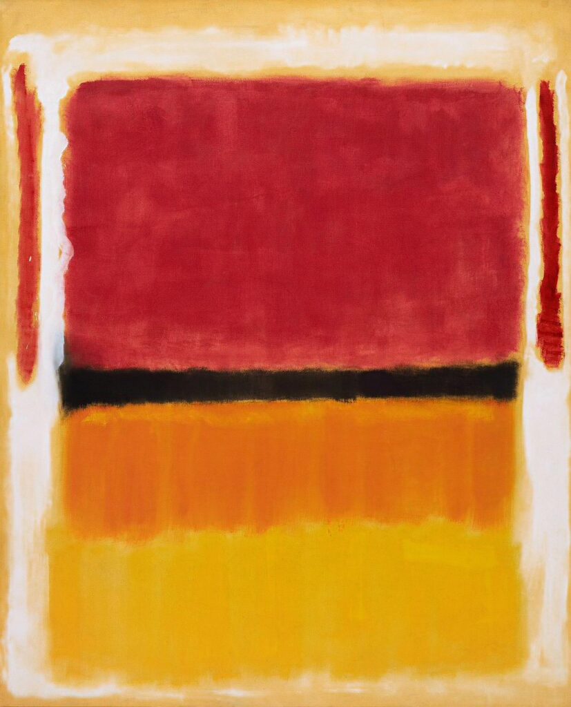
Untitled (Violet, Black, Orange, Yellow on White and Red) (1949)
Here’s a transitional piece in Rothko’s career. Untitled (Violet, Black, Orange, Yellow on White and Red) shows his early exploration of colour blocks, edges and emotional layering. It is less serene, more charged, more exploratory.
He was acclaimed because he wasn’t afraid to experiment. This work shows tension, contrast, complexity, all without figures. For many artists, the lesson is clear: you can carry narrative emotion without literal subject matter.
If you’re working abstractly or loosely with landscape, think: what happens if you let form reduce, colour dominate? What does emotion look like if you remove people and objects? Let shape and hue speak.
Notice how the palette here is varied, violet, black, orange, yellow, white, red, yet the composition remains unified. Use contrast, yes, but also coherence. Ensure your palette reflects one voice, one feeling.
And remember: experimentation often precedes clarity. Rothko’s later works refine ideas you see here. In your practice, give space for the messy, the not‑sorted‑out. It feeds the strong work that comes later.
No. 14 (1960)
No. 14 shows Rothko at a mature moment: broad horizontal zones of colour, layered, glowing, skipping figure or narrative entirely. It immerses you rather than tells you a story. The acclaim comes from how completely this work invites you in.
He once said he wanted his paintings to be experiences, not just images. This piece delivers: you walk into it, you feel its scale, you feel the subtle shifts in hue and texture. That kind of work becomes timeless.
In your work, ask: how can the viewer be surrounded by the piece, not just view it? Can your colour fields, your landscapes envelop or invite reflection? Try giving your work breathing space.
Look at how the colours sit, how the layers hint at depth, how light moves across the surface. This isn’t about flashy contrast, it’s about subtlety and staying power.
Finally, the acclaim of this work reminds us: reducing elements doesn’t mean reducing impact. Sometimes the most powerful voice comes when you strip back and focus. Let your art carry weight by saying less, but meaning more.